We all want our projects to operate smoothly and efficiently, but determining how things are truly going may be difficult. Jira Cumulative Flow Diagram (CFD) is a powerful tool for project management that can help teams visualize the flow of work through their project.
Perhaps you’re not aware of a bottleneck, or people are drowning under the weight of too many tasks? Or maybe you just want a cool graphic representation of the recent sprint?
By providing a visual representation of the status of work items, CFDs make it easy to identify bottlenecks and potential issues in the workflow.
Continue reading to learn how to use cumulative flow diagrams to address process improvement problems, beginning with a basic definition.
What is a Cumulative Flow Diagram?

To understand how CFDs work, it’s important to first understand the basic components of a CFD. The x-axis of the diagram represents time, while the y-axis represents the number of work items in a particular status. Each status is represented by a different color on the diagram, and the area under the line for each status represents the cumulative number of work items in that status over time.
The diagram, as the name implies, collects every task so you can better understand the performance of teams and tasks. For example, by observing how tasks pile over time, you can determine where you might improve your process’s efficiency.
CFDs are an important component of the Kanban product management approach. This agile management approach is intended to assist you in optimizing team efficiency without overburdening all team members.
Workers pick jobs from a central pool rather than being allocated by a supervisor. This is visualized using a Kanban board, where each column represents a workflow step and each card represents a story. The tale is tracked as it progresses through the workflow, from the beginning (story added to the backlog) to the end (work on the story is completed).
What does a Cumulative Flow Diagram show?
A Cumulative Flow Diagram (CFD) in Jira shows the flow of work items (such as tasks, bugs, or stories) through different statuses in a project. The x-axis of the diagram represents time, while the y-axis represents the number of work items in a particular status. Each status is represented by a different color on the diagram, and the area under the line for each status represents the cumulative number of work items in that status over time.
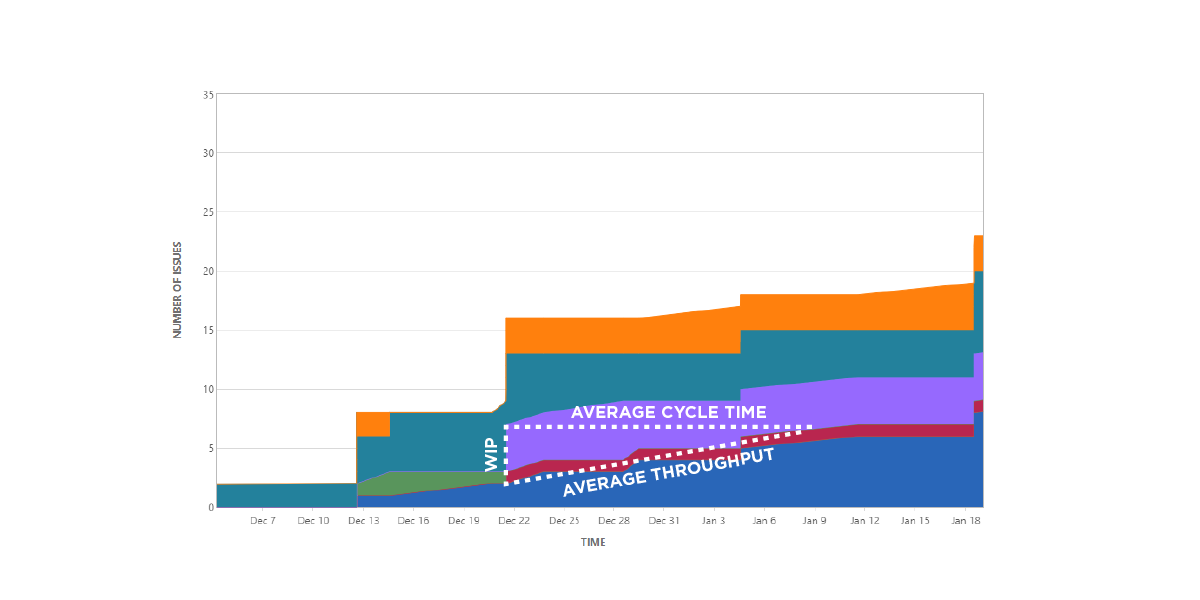
Cumulative flow diagrams aggregate every job in your workflow to see three key metrics:
Cycle time: This is the overall amount of time it takes your team to accomplish each activity from start to finish. This allows you to see where your workflow can be optimized to reduce cycle times.
Work in progress: The amount of tasks that your team is currently working on at any one time. Cumulative flow diagrams are then used to depict inefficiencies, such as when your team has too much or too little work in progress at any particular time.
Throughput: The amount of jobs completed by your team in a given time period. Cumulative flow diagrams, as the ultimate measure of your team’s productivity, highlight where you can align efforts and resources so that throughput grows over time.
CFDs can be used to identify bottlenecks in the workflow, trends in the workflow, and areas where work items are getting stuck. They can also be used to track the performance of different team members, and to identify areas where the team is making progress or where they need to focus their efforts. By providing a visual representation of the status of work items, CFDs make it easy to understand the flow of work through a project and identify any potential issues that need to be addressed.
How to read and interpret a Cumulative Flow Diagram?
A Cumulative Flow Diagram (CFD) in Jira is a visual representation of the flow of work items through different statuses in a project. To read and interpret a CFD, you’ll need to understand the basic components of the diagram and the information it’s trying to convey.
The x-axis of the diagram represents time, with the earliest date on the left and the most recent date on the right. The y-axis represents the number of work items in a particular status.
Each status is represented by a different color on the diagram, and the area under the line for each status represents the cumulative number of work items in that status over time.
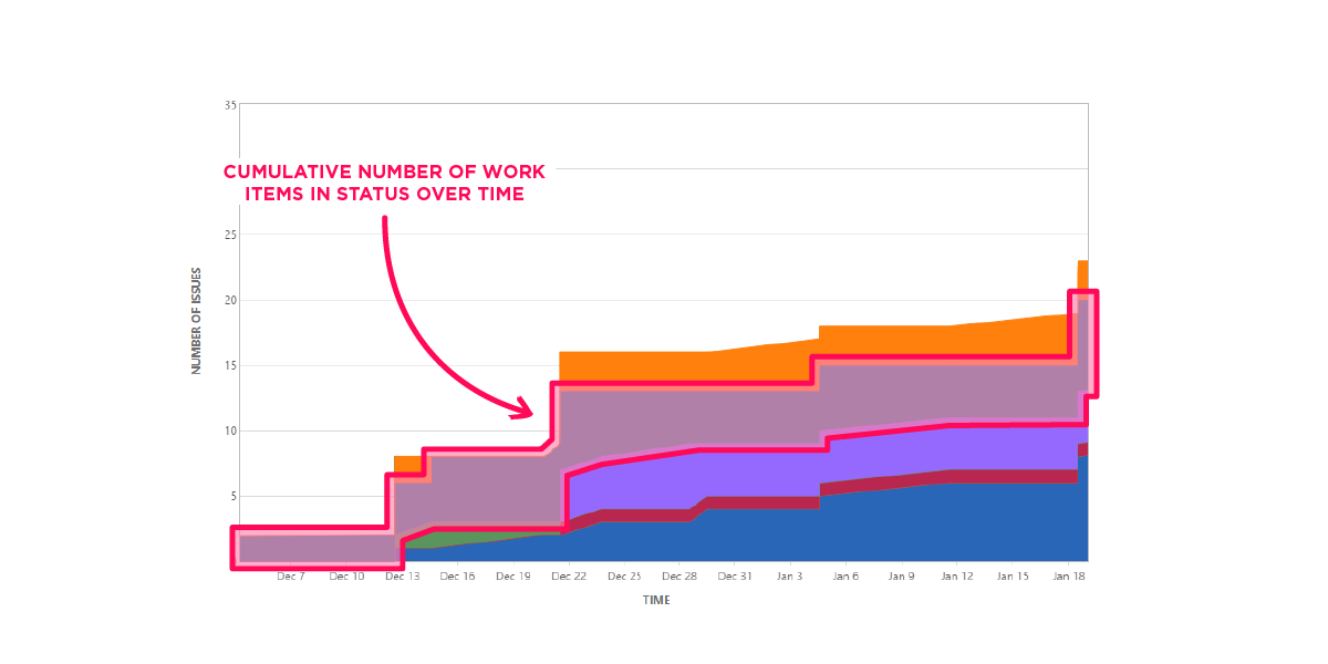
To interpret a CFD, you should focus on the area under the line for each status. If the area is increasing, it means that more and more work items are being added to that status, which could indicate a potential bottleneck. If the area is decreasing, it means that work items are moving through that status quickly and that the team is making progress.
You should also pay attention to the slope of the line for each status. A steep slope indicates that work items are moving through that status quickly, while a shallow slope indicates that work items are moving through that status slowly. This can help you identify bottlenecks and areas where the team needs to focus their efforts.
You should also pay attention to the gaps between the lines for different statuses. A large gap between the lines for two statuses could indicate that work items are getting stuck in one of those statuses, which could be a sign of a bottleneck.
Finally, by overlaying the CFD with other data points you could get an idea about the correlation or causality. For example, if there’s an increase in the number of bugs being reported, and a decrease in the rate of completed bugs, then it could be an indication that bugs are causing delays in the project.
It’s also important to note that you should use CFD along with other metrics, like burndown charts, velocity charts, and lead time, for a more complete understanding of the project.
How to read the lead time from the chart?
Lead time is the amount of time it takes for a work item to move from the start of the workflow to the completion of the workflow. In a Cumulative Flow Diagram (CFD), lead time can be read from the x-axis, which represents time.
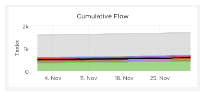
To read the lead time from a CFD, you’ll need to identify the time period between when a work item enters the workflow and when it exits the workflow. The time period between the start of the workflow and the completion is the lead time.
To read the lead time from the chart, you can use the following steps:
- Identify the status where the work item enters the workflow. This is typically the first status on the left side of the chart, represented by the line that starts at the bottom of the y-axis.
- Identify the status where the work item exits the workflow. This is typically the last status on the right side of the chart, represented by the line that ends at the top of the y-axis.
- Measure the time period between the start of the workflow and the completion of the workflow. This can be done by measuring the distance between the two statuses on the x-axis.
You can also measure the lead time for a specific work item by identifying the date the work item entered the workflow and the date it was completed. The time period between these two dates is the lead time for that work item.
It’s important to note that lead time calculated from the CFD is an average lead time for all the work items in the workflow, and it may not reflect the lead time for every single work item. It’s also important that lead time can be affected by various factors such as complexity of the work item, availability of resources, and external factors which can be further analyzed by looking at lead time by different attributes or comparing with other metrics like burndown chart, velocity chart, and CFD.
How to read the cycle time from the chart?
Cycle time is the amount of time it takes for a work item to move from the start of a specific process or stage of the workflow to its completion. In a Cumulative Flow Diagram (CFD), cycle time can be read from the x-axis, which represents time.
To read the cycle time from a CFD, you’ll need to identify the time period between when a work item enters a specific process or stage of the workflow and when it exits that process or stage. The time period between the start and end of a specific process or stage is the cycle time.
To read the cycle time from the chart, you can use the following steps:
- Identify the status where the work item enters the specific process or stage of the workflow. This can be any status on the chart, represented by a line on the diagram.
- Identify the status where the work item exits the specific process or stage of the workflow. This can also be any status on the chart, represented by a line on the diagram.
- Measure the time period between the start of the process or stage and the end of the process or stage. This can be done by measuring the distance between the two statuses on the x-axis.
You can also measure the cycle time for a specific work item by identifying the date the work item entered the process or stage and the date it was completed. The time period between these two dates is the cycle time for that work item.
It’s important to note that cycle time calculated from the CFD is an average cycle time for all the work items in the process or stage, and it may not reflect the cycle time for every single work item. Cycle time can be affected by various factors such as complexity of the work item, availability of resources, and external factors which can be further analyzed by looking at cycle time by different attributes or comparing with other metrics like burndown chart, velocity chart, and CFD.
It is also important to understand that Cycle time and Lead time are different, lead time is the time it takes for a work item to move from the start of the workflow to the completion of the workflow, while cycle time is the time it takes for a work item to move from the start of a specific process or stage of the workflow to its completion.
Benefits of using Cumulative Flow Diagrams and why are they useful?
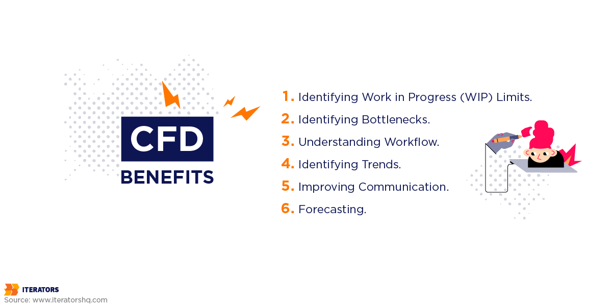
A cumulative flow diagram (CFD) can help you in various ways as a project manager or a team member:
- Identifying Work in Progress (WIP) Limits: CFDs can help you identify if you have too much work in progress and if it’s impacting the flow of work. This can help you set appropriate WIP limits and improve the flow of work.
- Identifying Bottlenecks: CFDs can help you identify bottlenecks in the process and areas where work is piling up. This can help you take corrective action to address these issues and improve the flow of work.
- Understanding Workflow: CFDs provide a clear view of the different stages of a process, and this can help you understand the workflow and how work items move through the process. This can help you make data-driven decisions to improve the process and increase efficiency.
- Identifying Trends: CFDs can help you identify trends and patterns in the flow of work, such as whether work is moving through the process at a steady pace or whether there are delays. This can help you identify potential issues that need to be addressed.
- Improving Communication: CFDs can be shared with team members, stakeholders, and managers, and this can help improve communication and visibility of the project status.
- Forecasting: CFDs can help you predict when work will be completed by analyzing the flow of work.
Overall, using CFDs can help you gain a better understanding of the flow of work in your project and take action to improve it.
What is a burn up and burn down chart?
A burn up and burn down chart are two types of charts that are commonly used in project management to track progress and identify potential issues. They’re particularly useful in agile development environments where teams are working on multiple tasks and delivering work in small, incremental chunks.
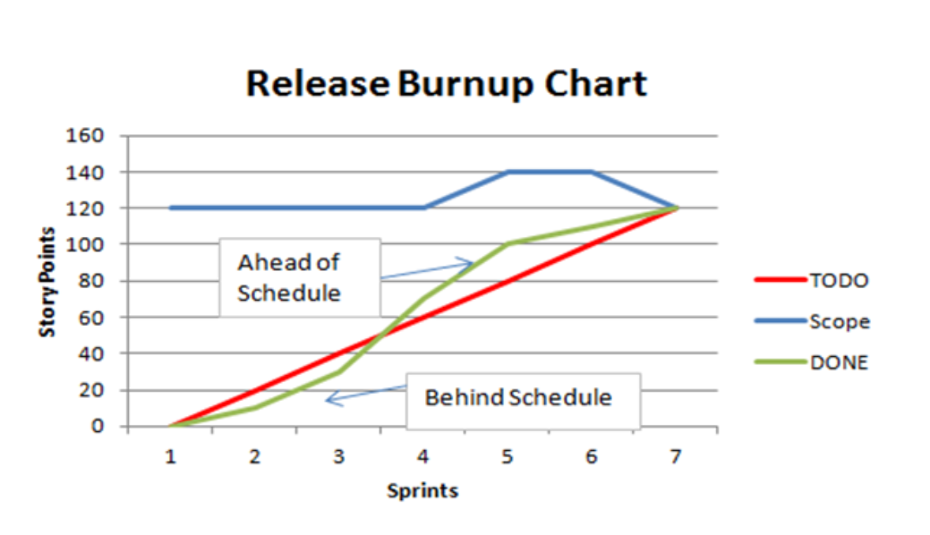
A burn up chart is a graph that shows the progress of work over time, with the x-axis representing time and the y-axis representing the amount of work that has been completed. The chart typically shows a line that starts at the bottom of the y-axis, representing the total amount of work that needs to be done, and another line that moves upward over time, representing the amount of work that has been completed. The difference between the two lines represents the amount of work that remains to be done.
A burndown chart, on the other hand, shows the remaining work over time. It works similar to a burn up chart but with the difference of the remaining work is plotted on the y-axis. The chart typically shows a line that starts at the top of the y-axis, representing the total amount of work that needs to be done, and another line that moves downward over time, representing the amount of work that has been completed. The difference between the two lines represents the amount of work that remains to be done.
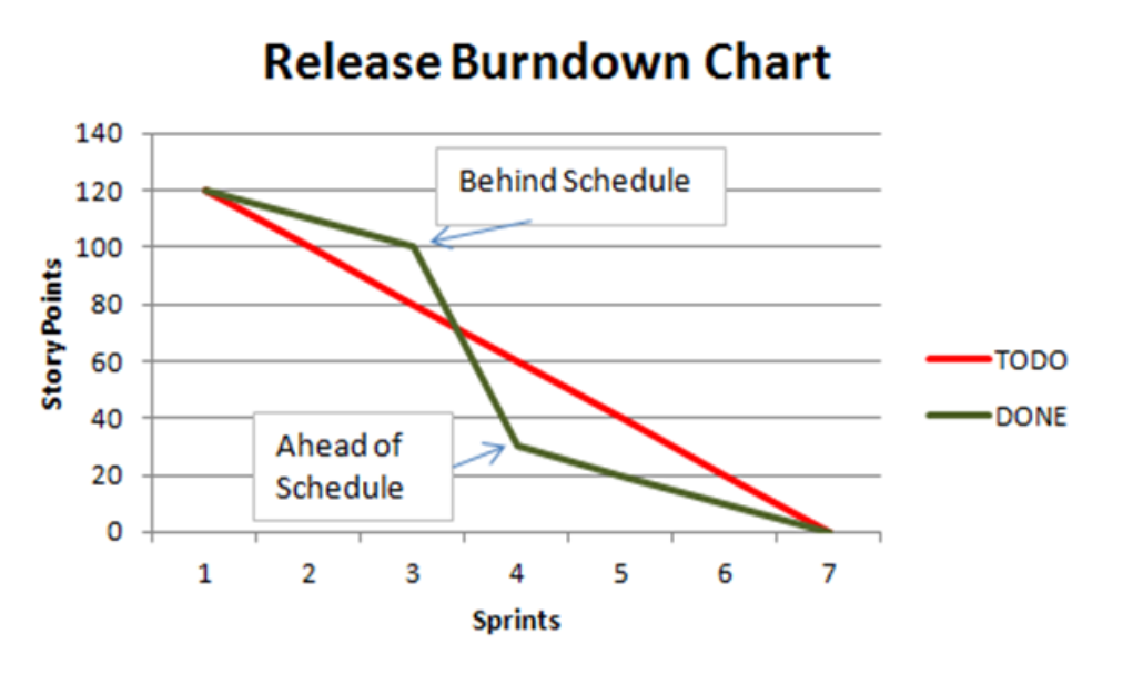
Both burn up and burn down charts can help project managers and team members understand how much work is left to be done, how quickly work is being completed, and whether the team is on track to meet their goals. By comparing the progress of work to the original plan, teams can identify potential issues and take corrective action before they become major problems.
How do you calculate the burn up and burn down chart?

You can calculate burn up and burn down charts in Jira using the following steps:
- Collect data: Gather data on the total amount of work that needs to be done, the amount of work that has been completed, and the date on which each piece of work was completed. This data can be collected from Jira’s issue tracking system, or from other tools that are integrated with Jira.
- Create the chart: Using the data collected, create a chart that represents the progress of work over time. For a burn up chart, the y-axis represents the total amount of work, and the x-axis represents time. For a burn down chart, the y-axis represents the remaining work, and the x-axis represents time.
- Plot the data: Plot the data on the chart, with the x-axis representing time and the y-axis representing the total amount of work or remaining work. Connect the data points with a line to create the chart.
- Analyze the chart: Look for trends and patterns in the chart, such as whether the team is completing work at a steady pace, or whether progress is slowing down. Compare the progress of work to the original plan, and identify any potential issues that need to be addressed.
- Update the chart: Regularly update the chart as new data becomes available, and continue to analyze the chart to identify trends and patterns.
It is important to note that to calculate burn up and burn down charts, you’ll need to have a clear understanding of your team’s workflow, the statuses that represent the completion of work and the correct data to be plotted. These charts are based on estimates, and they can be affected by various factors such as complexity of the work item, availability of resources, and external factors.
The burn up and burn down charts are great tools for visualizing the progress of work and for identifying potential issues that need to be addressed. By analyzing the charts, teams can make data-driven decisions and take corrective action to ensure that they stay on track and meet their goals.
Burn up chart vs. burn down chart: what are the differences?
Burn up charts and burn down charts are both used to track the progress of work in project management, but they differ in how they represent the data. A burn up chart shows the progress of work that has been completed, while a burn down chart shows the remaining work. Both charts can be used together to have a clear picture of the progress and predict the completion date.
Why should you use a burn up and burn down chart?
You can use both burn up and burn down charts to track progress of work items and not to measure lead time or cycle time which are different metrics. These charts are also commonly used in conjunction with other metrics such as CFD, velocity chart, and Kanban board to have a holistic understanding of project progress.
Conclusion
A cumulative flow diagram (CFD) is a visual representation of the flow of work through different stages of a process. It’s a useful tool for project management because it provides a clear and concise view of the status of work items and the flow of work through different stages of a process.
One of the key benefits of CFDs is that they can help teams identify bottlenecks in the workflow. For example, if the area under the line for a particular status is consistently increasing over time, it could indicate that there is a bottleneck in that status. This could be caused by a lack of resources or a lack of clear processes for moving work items through that status.
A cumulative flow diagram, in essence, allows you to view the whole workflow in order to discover problems with your operations. It can aid in reducing average cycle time, increasing team output, and managing WIP restrictions.
