You’ve probably heard your team discuss “redesigning the UI” or “improving the UX of your mobile application.” While these are not deep technical terms, people tend to mix them up.
This article shows how UI design differs from UX design, comparing and contrasting them in detail.
“Design is a form of communication. If you direct it to the wrong audience, use the wrong words, or communicate your message unclearly – the design fails. Good design cannot exist without good UX.”
Izabela Kurkiewicz
Already know you’re gonna be working on UI and UX for your startup or enterprise? At Iterators we can help design, build, and maintain custom software solutions for both startups and enterprise businesses.
Schedule a free consultation with Iterators today. We’d be happy to help you find the right software solution to help your company.
UI: User Interface
It’s important to clarify what the “user interface” of an application, website (which is actually a kind of software), or other entity, represents.
What is User Interface?
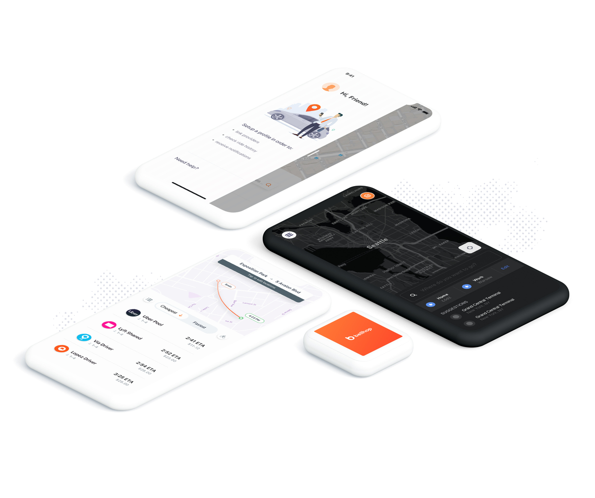
User interface is the point of interaction between the user and a digital product or device. Common examples include the touchpad you use in selecting the amount you would like to withdraw from an automated teller machine (ATM) or the touchscreen of your iPad or smartphone.
User interface design for apps and websites consists of the look, feel, and interactivity of the product. The goal is to ensure the UI is as intuitive as possible, so it thoughtfully considers all visual, interactive elements the typical user may encounter.
Key elements of UI design
UI design considers buttons, color schemes, icons, imagery, spacing, responsive design, and typography.
UI design helps to transfer a product’s development, research, content, and layout into an attractive, nurturing, and responsive experience for users. Therefore, the summary of UI design is as follows:
- It’s purely digital and considers all the visual interactive elements of a product interface such as buttons, color schemes, icons, responsive design, spacing, and typography.
- It aims to visually guide the user through a product’s interface. It creates an intuitive experience that doesn’t require the user to overthink things.
- It transfers the brand’s strengths and visual assets to a product’s interface, ensuring the design is coherent, consistent, and aesthetically pleasing.
UX: User Experience

The better your user experience is, the more your business will grow. Using examples as guidelines, we’ll provide you with best practices for designing a comprehensive UX that customers will love.
What is User Experience?
It’s necessary to ensure that the user experience of your product or service is efficient. User experience, or UX is the entirety of how users interact with your product, and how the interaction with your product’s UI makes them feel.
Consider an e-commerce website; if customers feel that your buying experience is complex, convoluted, and endless, this is definitely bad UX! The customer wants her buying experience to be easier than the last time and without any hassle so if your product offers this, the UX is worth it.
Good website UX helps you win over and keep customers over the long term. It’ll also help them decide to shop for products on your website instead of your competitors.
A good user experience means pleasant product function, however, it’s highly important. Offering a better UX can quickly differentiate your company in a saturated marketplace.
Key elements of UX design
UX design comprises the overall feel of the experience, the UX designer pays attention to the user’s entire journey – the steps they take to conversions on your website – to solve a specific problem. But they need to know what tasks they need to complete, the steps they need to take, and how straightforward the experience is.
The work of UX design cuts across the problems and pain points that users encounter and how your product might solve them. Extensive user research – ascertaining who your target users are, their behavior, and preferences – reveals who your target users are and what their needs are concerning a specific product of yours.
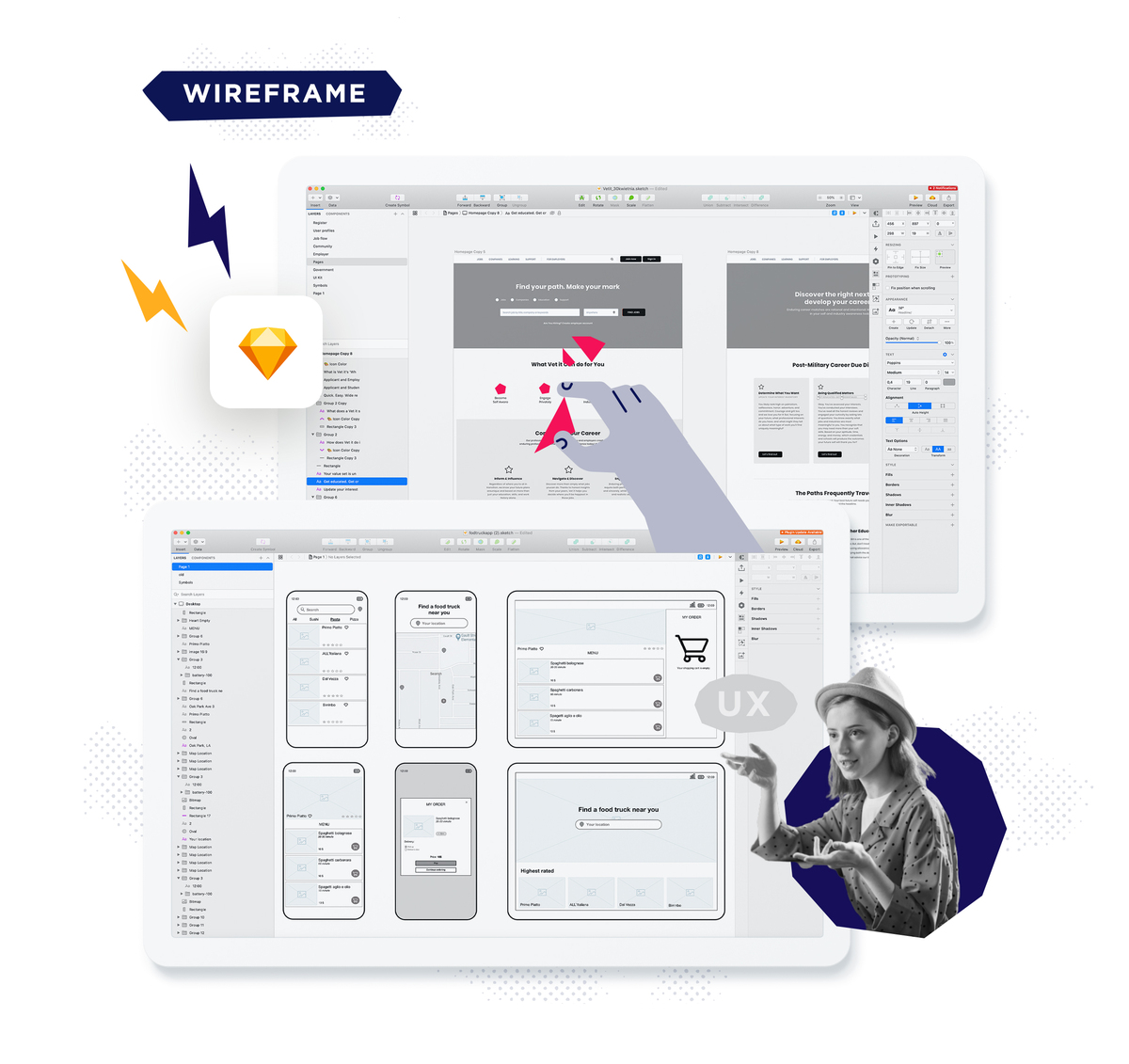
You’ll consider things like information architecture – the layout of information on your app – when mapping out the user’s journey. This refers to the organization and labeling of content across a product and the kinds of features the user might need. Then, there’s the creation of wireframes – a barebones visualization of your website or application using lines – to lay out the skeletal framework of the product.
The UX designer maps out the skeleton of the product in tandem with the UI designer. In summary:
- UX design identifies and solves user problems.
- It’s the first step in the product development process, preceding UI. This step typically begins with researching the user and their preferences, designing the ideal experience for them, and helping them to discover your solution and use it right.
- UX applies to all kinds of products, services, or experiences.
Examples of effective UX design
Here are three examples of effective UX design.
1. N26
The banking platform from N26 offers users a personalized way to manage their finances. Despite offering a great service, it doesn’t try to show off fancy graphics. There are multiple ways to organize financial information on the app, including statistics and detailed infographics on spending.
Users can also personalize the app using different images or descriptions, so it’s an end-to-end flexible, customizable user experience.
The app also offers default options for every stage so users have less decision-making to do.
N26 has designed the app to be easy to use, and yet very secure. For example, users need to provide fingerprint or password recognition to keep things secure.
2. Keurig
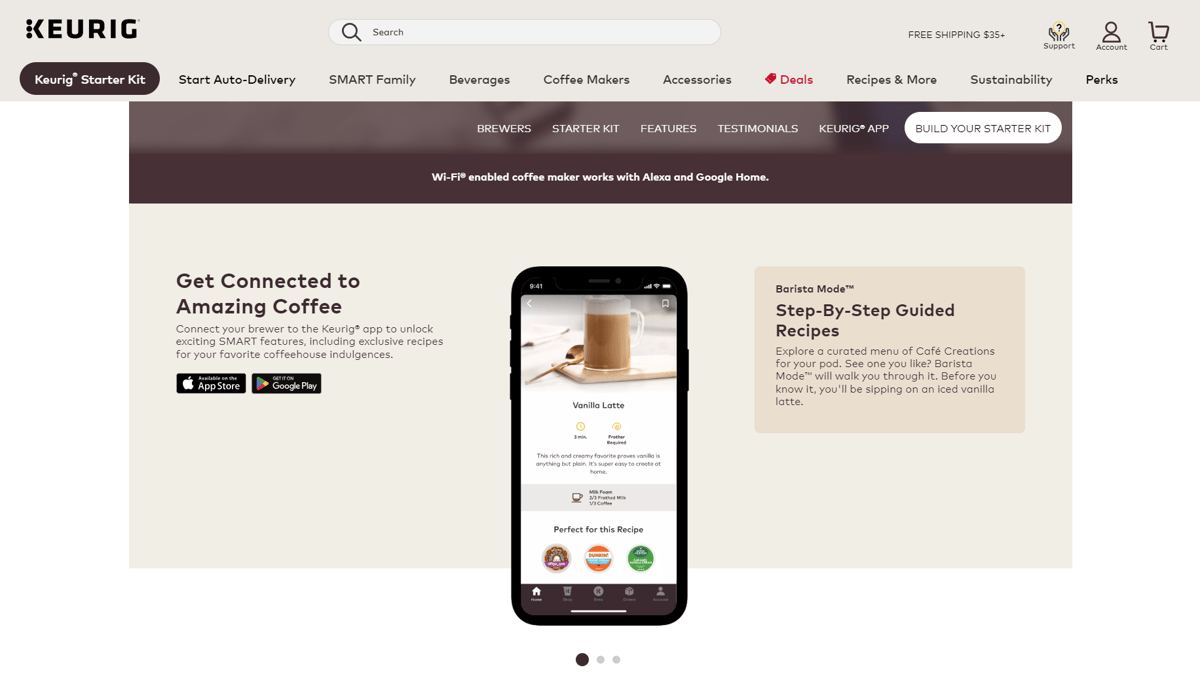
The Keurig website provides an informative customer experience in offering its premium coffee machines and flavored beverage pods.
The company’s coffee machines are rather sleek and usable, and the buyer journey reflects this. There’s a priority on design aesthetics and ease of use.
The UX design works because it excellently blends visual simplicity with technically dense product details that buyers love to know.
Detailed multi-angle pictures of the products and features are available. The product information is then distributed across intuitive chunks of specifications explained in clear language.
The product details show users how each feature will make their morning coffee taste even better, while guiding them to imagine how the product will improve their life.
The website also offers reviews you can read while still on the product page. The smooth buying experience lets you know which models and colors are in stock. Users can even compare products, helping them with which product better fits their needs and budget.
3. Babbel
You’ve probably tried Babbel. But, did you notice that compared to other language learning platforms, Babbel is minimalist?
Babbel’s lean learning interface helps users focus by eliminating distractions. Even when you try the app, you’ll quickly notice the immersive flow that you’re drawn into.
This exceptional UX design combined with user research and education research helps Babbel to meet user needs for a focused and stimulating learning environment. Learning sessions are full-screen, without extra buttons. The lessons themselves are a blend of text, audio, and video materials that keep things varied and engaging – yet you’re learning all the time.
One UX path allows you to follow lessons in a structured and progressive manner, while the other allows you to take a lesson for a few minutes and do the same with another. You choose what works for you.
Babbel also makes use of gamification on its learning platform. Users are provided scores to beat using positive reinforcement, and the platform pitches lessons to offer a challenge. However, the challenges are simple enough to keep their learning juices flowing.
The Babbel UX and UI help users quickly settle down into the platform, keeping them engaged as they learn to go beyond “Hello!” in any language.
Risks of Neglecting UI and UX in Product Design
Many companies design products with more concern for profits than UX and UI. This could be costing them much more than they realize. The core idea behind paying attention to UX and UI is to respond to customer expectations with a pleasant experience and visual appeal.
So, why shouldn’t you ignore UX and UI in your product design?
- Mobile-responsive apps: You’ll avoid serving customers a website that’s not mobile-responsive. Which would present your company in a bad light. Endless scrolling just to read product copy or make a purchase can be boring… and annoying!
- Better performance: An app with poor performance has the potential to send your users to your competitors. It’s hard to win back customers irritated by the bad performance of your application or website. Your objective should be to de-emphasize the visibility and strengths of the competition. From the product design to its architecture and actual coding, make decisions that open up even more potential for business growth.
- Visual appeal: Your product starts to win when it’s aesthetically pleasing. This is known as the aesthetic usability effect. Users tend to perceive aesthetically pleasing designs to be more usable, according to NNG. Users show a positive emotional response to your visual design, causing them to easily ignore minor usability issues in your app. Therefore, your UI should also be functional.
- Right functionality: While looks may be a great consideration, functionality is indispensable. The point of visiting your website is to do something concrete like buy lingerie or sign up for a class. This experience becomes more mouthwatering if your website loads fast. A loading time approaching 5 seconds is already too slow and will make your retention rates drop. It can also impact your Google search ranking.
- Better conversions: Bad UX design will cost you money. As an e-commerce website, consider having fewer steps for users to do anything, for instance. Making the buyer journey easier will greatly improve your conversion rates.
- More revenues: Amazon once saved $300 million in one year by adjusting a single form button. They helped the user to buy products without creating an account, leading to more sales. The few hours it took to make that button made a multimillion-dollar company richer! Is there a button on your website you could tweak to make more sales?
Emerging Trends in UI and UX Design
Top UI Design Trends of 2023:
- Large Font Size and Immersive Experience: Designers are emphasizing larger and more readable fonts to enhance readability, especially on mobile devices. This trend is geared towards creating an immersive experience that engages users from the moment they interact with the interface.
- No More Parallax Scrolling: While parallax scrolling was once a popular design technique, it’s giving way to smoother and more efficient scrolling methods. This change is driven by the need for better performance and a focus on providing a more seamless user experience.
- Generative AI in the Design Process: Generative AI tools are being integrated into the UI design process to assist designers in generating creative and unique design elements. These tools can produce a variety of design options, helping designers explore new possibilities more efficiently.
- Full Use of the Card UI Component: Card-based design elements continue to be a favorite due to their flexibility and ability to organize content in a visually appealing manner. Designers are exploring creative ways to use card UI components to display information in a modular and engaging fashion.
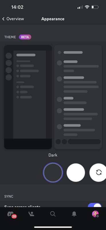
- Light Mode with an Option for Dark Mode: Offering both light and dark modes has become a standard practice in UI design. Dark mode reduces eye strain and enhances visual aesthetics, while light mode maintains familiarity and readability. Providing this choice accommodates user preferences and different lighting conditions.
Top UX Design Trends of 2023:
- How We Build vs. What We Build: UX designers are increasingly focusing on the processes and methodologies used to create products. Collaboration, agile workflows, and cross-disciplinary teams are gaining importance alongside the actual end product.
- Mass Migration from Adobe XD to Figma: Figma’s collaborative features and browser-based accessibility have led to a significant migration of designers from other platforms, such as Adobe XD. This shift is reshaping design workflows and encouraging real-time collaboration.
- Accessibility Becomes a Legal Requirement: Accessibility in digital products is no longer just a best practice; it’s becoming a legal requirement in many regions. Designers are paying closer attention to creating inclusive experiences that cater to users with disabilities.
- Incorporating AR into Everyday Life: Augmented Reality (AR) is moving beyond novelty and gaming applications. UX designers are exploring ways to integrate AR into everyday experiences, such as shopping, navigation, and learning, to enhance usability and engagement.
- Creating Values Through Qualitative UX Research: Beyond quantitative data, designers are placing greater emphasis on qualitative research methods. Understanding user behaviors, emotions, and motivations provides insights that lead to more meaningful and user-centric designs.
These trends showcase the dynamic nature of UI/UX design in 2023, where a combination of technological advancements, user needs, and design philosophies are shaping the digital experiences of today and tomorrow.
Why do you need to focus on user-first design?
Understanding user, customer, or client personas, preferences, and behaviors enables your designers to create a product that is both functional and pleasing. Design thinking and human-centric design emphasize user research and testing as critical components of the design process.
Testing and iterating the design based on user feedback enables your UX and UI designers to effectively collaborate and deliver a positive user experience. Test-driven design ensures the final product outcome is informed by user preferences, building precisely what the market wants.
UI vs UX: What’s the Difference?
Good UI and good UX are indispensable elements of comprehensive product development. In developing a fintech application, for instance, it’s possible to have a smooth yet jaw-dropping user interface. There might be another problem, however.
The same app may require users to encounter endless screens to make a single money transfer. This is a user experience problem because money transfers should be as painless as possible. If users find it an ordeal to use your app (regardless of what it does), they’re more likely going to stay away from it. The outcome would be similar if your corporate or sales websites took more than a few milliseconds to load.
Here’s a table that summarizes the main differences between UX and UI:
| UX Design | UI Design |
| UX Design means User Experience Design | UI Design means User Interface Design |
| Focused on items that influence the user’s journey to solve a problem | Focused on a product looks and how users interact with it |
| Involves content, development, prototyping, research, and testing | Provides the user with a visual guide to navigate a product using interactive elements |
| Develops and improves quality interaction between a user and all elements of a company | Communicates your brand’s strength and visual assets |
| The entirety of the user experience may transcend product screen | Often visual and information designs around screens |
| Involves creative and convergent thinking | Involves creative and analytical thinking |
| Client needs and requirements typically define the final outcome | User needs and research mostly determine the final UI design |
Why are both important for product design?
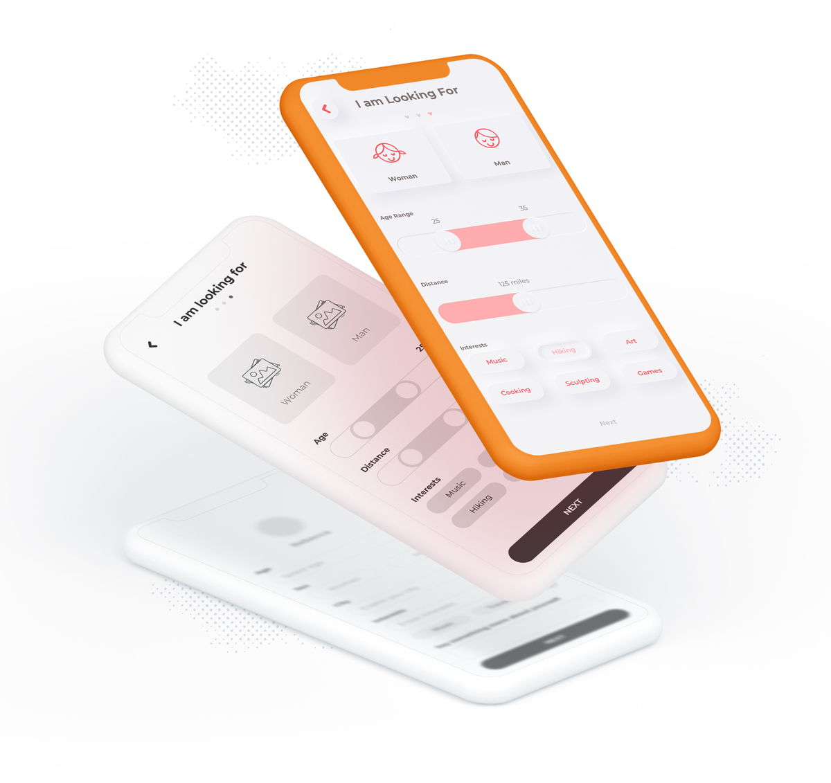
Both UX and UI are crucial elements of product design. They guarantee a polished product experience for the user.
Bringing UI and UX together in your product design will attract your users and make them stick with you.
Having a great UI and bad UX gives you a pretty website or app that’s not functional. On the other hand, an app with poor UI will offer bad UX will offer great function but poor aesthetics.
Bringing UX and UI in synergy leads teams to create a more effective, pleasant, and seamless product experience for the end user. But there needs to be a way for the teams to ensure that this process is smooth.
It’s important to realize that collaboration between UI and UX teams needs to begin early in the design process. It ensures that both teams are a good fit in terms of goals, user needs, and the overall direction of design.
The next step will be to follow through on communication and check-in schedules between both teams. In this way, you can identify potential issues and provide opportunities for feedback and iterative development.
A singular design system shared between the teams helps to ensure consistency for the user in terms of visual language, interaction, and experience. As long as both parties agree to focus on the user, it’s much easier to build an intuitive and seamless experience.
It’s also necessary for both teams to participate in usability testing. This provides common insights into how users interact with your product, ensuring that you easily identify areas that need improvement.
While they appear to be different, UX and UI are not entirely distinct entities. Instead, they work hand-in-glove to determine how your product looks and functions. They are complementary in role because they influence each other.
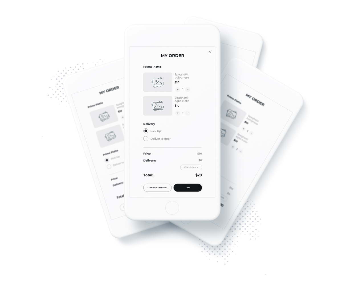
Imagine your product team working hard to deliver a beautiful website that your users find hard to navigate. After a bad first experience (if they manage to complete it), it’s often difficult to convince such users to return. This type of problem may persist even after your website’s UX functions thoroughly complement its attractive interface.
Consider the opposite scenario where you conduct user research early on and test for an optimal user experience. Imagine that your website text is so light that people struggle to read it. Despite the good UX, your users will be less keen to use a product offering an unpleasant or non-accessible UI experience.
The point here is that UX isn’t complete without UI and vice versa. When you’re creating a user-first product, it’s advisable to consider both aspects to ensure that potential users can interact with your product easily and walk away fulfilled.
Tools for UI and UX Design
It’s necessary to use the right tools for every task. Therefore, trying to use Microsoft Paint for your UI design won’t cut it. There are dedicated industry-grade UX and UI design tools that are both intuitive and comprehensive.
What is UX design?
First, though, what is user experience design? UX design involves creating user-friendly interfaces that are easier to use and ensure users are satisfied.
The entire focus of UX design is the user and their needs. A UX designer building interfaces should let the users’ needs and perceptions be the defining element of their work. Therefore, they need to ask questions that align with:
- What type of person will visit the app or website? This is also known as the persona.
- What are the expectations of the potential user?
- How can the user make the most of their experience on the mobile app or web app?
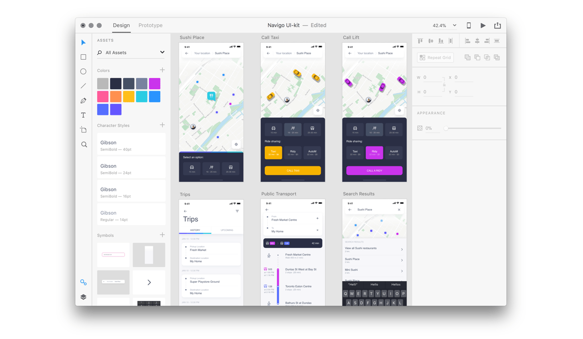
1. Sketch
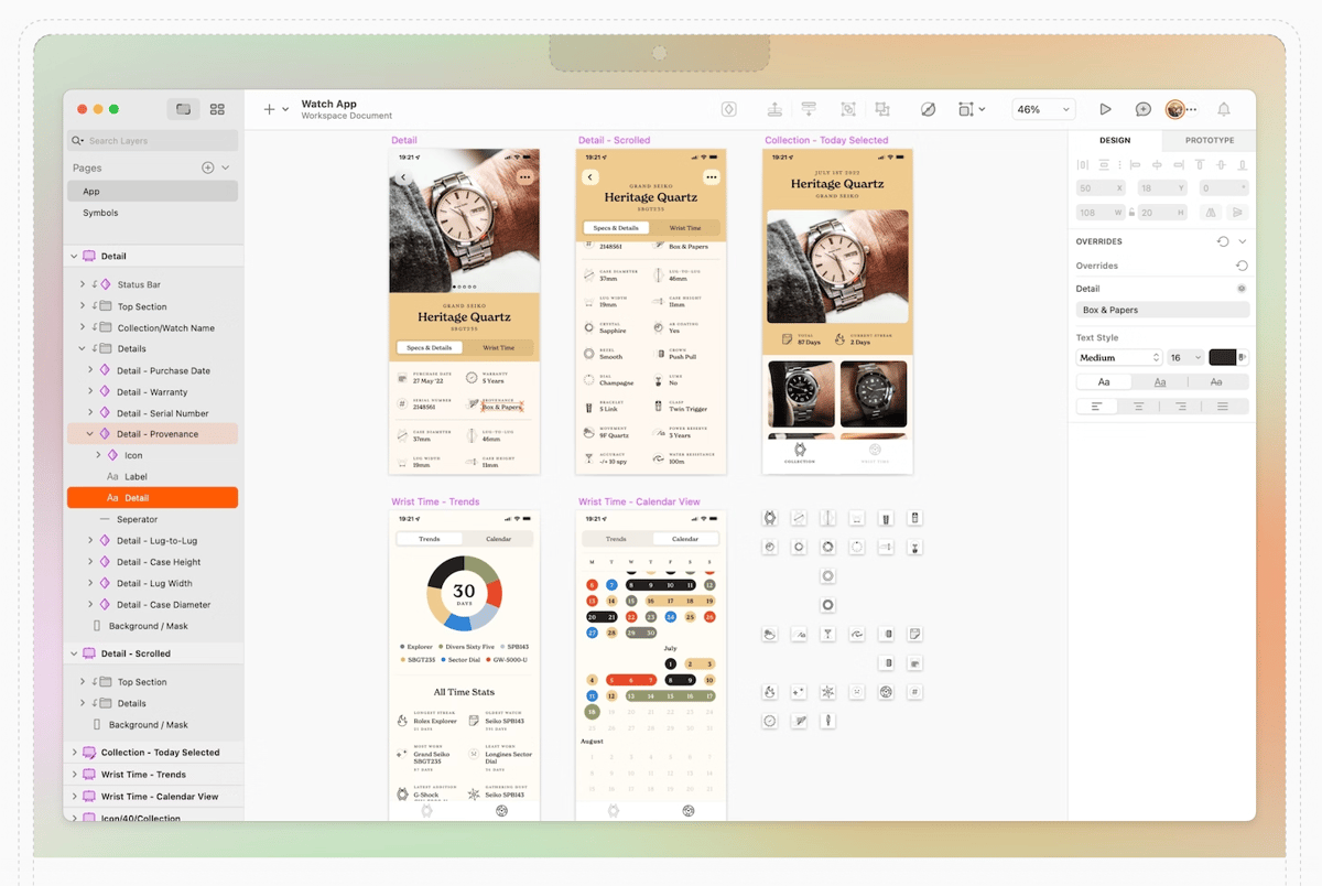
The self-styled “all-in-one designer’s toolkit” is usable across the entire design workflow. Also, your team can use it with a pool of more than 700 extensions and several third-party software. The extensions include assistants, plugins, and integrations.
Once upon a time, Sketch was only available on macOS computers. Thanks to the web app, however, the makers have made this highly-fancied tool available to lovers of Windows and other operating systems. With a growing user base, it would be a welcome development to have native Sketch versions for those operating systems, especially for performance reasons.
Symbols, Text and Layer Styles, and Color Variables libraries and share them instantly with collaborators. The best part is the sharing process is automatic.
Pricing: Sketch is available for $9 per user per month.
2. Figma
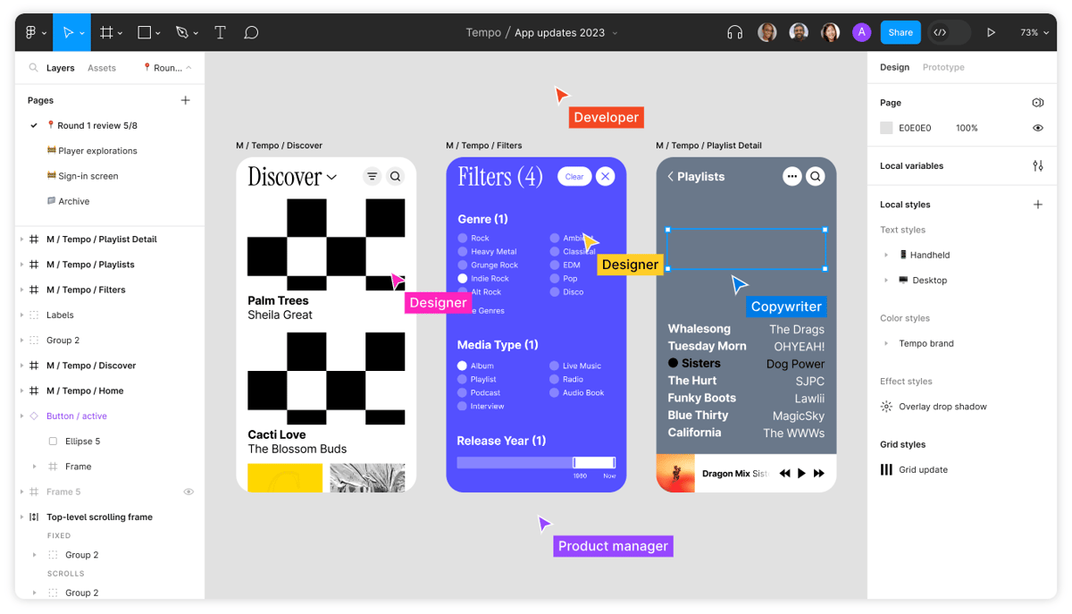
Many product designers swear by the power of Figma. Being one of the more popular design tools available, it’s reliable in many respects.
Figma is cloud-based and works well for designing and building prototypes with gorgeous design features. Your UX and UI design teams can use it to create wireframes and other deliverables such as mood boards.
The Figma layout is huge, so you can have multiple iterations on the same projects and compare designs with ease.
Figma is a highly collaborative piece of software, so multiple users can make changes to a design simultaneously, without the need to download files locally. The browser functionality makes it accessible to anyone regardless of their operating system.
You can also do A/B user testing in Figma. In addition to audio conversations, overlay, and version history, it offers a pen tool for generating arc designs. FigjJam is another of its popular features; it’s an online whiteboard designed to make collaboration easy.
Pricing: Figma is available for free for up to 3 projects, whereas the paid plan starts at $12 per editor per month.
3. Adobe XD
Designers love the Adobe product ecosystem. Adobe Photoshop and Illustrator are so popular that the former has become a verb in pop culture.
The company distributes its apps as part of the Adobe Creative Cloud suite that UI and UX designers love to use. While Photoshop and Illustrator are effective and popular, Adobe XD is now emerging as the preferred toolset for UX/UI designers.
Adobe XD allows you to create realistic app designs, brand designs, game designs, and web design prototypes. If subscribing for the entire Adobe Creative Cloud suite is more than you need, you can opt to pay for Adobe XD alone.
Pricing: The Free Adobe XD plan is available for single documents, while the starting plan price begins at $9.99 per month. If you’re a large company, you may prefer to go for the Creative Cloud package because despite the high price of tools like Photoshop, bundling other products like Indesign and Illustrator with XD tends to make it a cheaper option.
4. InVision Studio

InVision is another popular design and collaboration tool that UX/UI designers love. With this software, you can create interactive prototypes and perform user testing, which we’ve already identified as important to ensure that your product is intuitive and easy to use.
Part of InVision’s popularity is fueled by its ability to integrate neatly with other design tools such as Adobe XD and Sketch. Do you want to collaborate with team members? No problem! InVision ships with decent collaboration tools and even includes version control, allowing everyone to see how a specific feature design has evolved.
There’s also InVision Studio, a new standalone digital design, and UX tool. Its impressive array of features includes built-in animations, interactive designs, and a vector drawing tool.
Pricing: Offers up to 3 documents free, while paid plans start at $7.95 per user per month.
5. Axure RP
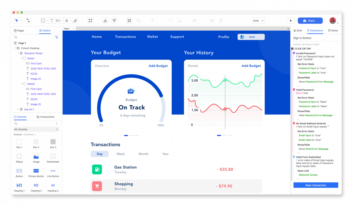
Axure is another UX/UI designer favorite. It enables designers to create wireframes, flowcharts, and prototypes in one place.
Part of Axure’s popularity is that it makes it easy to create detailed and interactive designs. Designers on teams can leverage its collaboration features for more efficient workflows. Multiple designers can work concurrently on a single project file.
Available for Windows and macOS, Axure provides a platform to create wireframes and low-fidelity prototypes that are easy to use but have robust functions. The software allows users to create prototypes with data-driven interactions, all this without the need for a single line of code.
Axure makes it easy to add features that can take a while to set up, including animations, dynamic panels, and graphic interactions.
Pricing: The starting plan for Axure costs $25 per user per month. The high price tag makes it a better fit for enterprises than individual users.
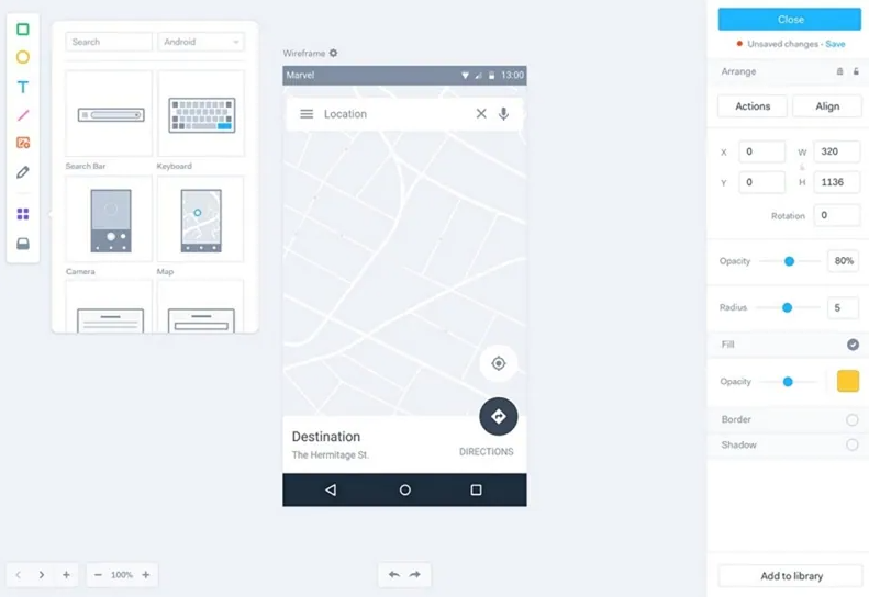
6. Marvel
No this has nothing to do with the superhero comic company. Instead, Marvel is a superhero design tool – minus the cape. The tool offers rapid prototyping, testing, and handoff for design teams.
You can quickly generate design specs and connect integrations to your workflow. For large teams, Marvel Enterprise 3 helps them to create awesome design products at scale.
But, Marvel works for individuals and small teams too.
Marvel is available as a web app, so you don’t install anything on your local machine. The learning curve is easy too, so with the array of assets and templates, it’s easy to see why new UX/UI designers are happy to try Marvel and end up sticking with it.
Marvel is available for browsers, iOS, and Android.
Pricing: There’s a single-user free plan that can handle one project. Paid plans for unlimited projects start at $12 per month if you opt to pay annually.
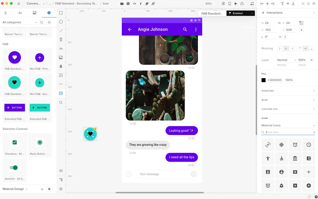
7. UXPin
UXPin is a veteran UX and UI tool that both new and experienced designers enjoy using. It is an end-to-end platform that works well for producing polished, interactive prototypes. One of the reasons UxPin has so many users is that there’s no need to know how to code to use it.
It’s easy to translate your team’s Photoshop or Sketch skills to UXPin because the interface is similar to those. Besides, it features several thousand design components out of the box.
Pricing: The limited 2-prototype version of UXPin is available for free, whereas for enhanced functionality, you can upgrade to the Basic plan for $19 per editor per month. There’s an Advanced plan for $29 per editor per month, while the Professional plan costs $69 per editor per month.
8. Webflow
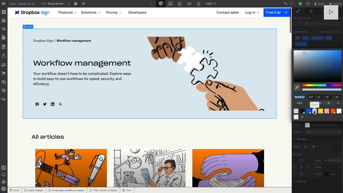
While the other apps on our list work on native operating systems, some cater to a mix of native OSs and web apps. However, some like Webflow break away from the norm and provide browser-only UX/UI design experiences.
Webflow is a website designer, builder, and CMS, or Content Management System, rolled up like a rich burger. Users do not need to know how to code, but Webflow allows UX/UI designers to design all they want and generate the code to send off to developers.
Pricing: The Free Webflow plan is available for only one website, while paid plans cost $12 per month or $19 per month for multiple users.
Best Practices for Designing Effective UI and UX
Visual design is hard, but a functional visual design that works for your prospective customers is even harder. Fortunately, there are common solutions for UX and UI design problems in any industry. Here are a few of these UI and UX best practices.
UI design for websites
User interface transmits a brand’s strength and visual assets to your app or website’s interface.
The role of the UI designer
The seasoned UI designer understands their responsibilities revolve around:
- The look and feel of the product, that is colors, form, shape, and texture
- Implementing a visual hierarchy that indicates to the user what next step to take
- Filling the website design with visual and interactive elements
- Taking responsibility to make the website more intuitive and responsive
Here are some ways to introduce user interface design best practices in websites:
- Be purposeful with displaying specific information in the page layout
- Understand what specific information should display on a specific screen
- Create consistency and use common user interface elements across pages
- Use color and texture strategically and sparingly
- Review the entire flow of the app
- UI designers need to focus on the end users’ journey
UX for websites
UX design aims to develop and improve quality interaction between a user and all elements of a company.
Web design is a vital piece in the web design puzzle. Customer support and other forms of client interaction happen on company apps or websites. A buyer may complete the entire customer journey on websites without ever visiting a physical store. This shows that web design is important in designing the user experience, making it a worthwhile investment.
The role of the UX designer
Here are the core responsibilities of your UX designer:
- Analyze your business needs and convert them into an impactful message
- Map out the structure of the user journey
- Pay attention to the psychology and behavior of users so you can design products and solutions that appeal to target users
Best practices in website UX
While there are several vital parts of websites that contribute to the user experience, here are five that will make your customers come back to you time and again.
- Firstly, your product’s navigation is fast and logical. Customers always prefer that they don’t have to think too much about where to click next. It’s also important that you have zero broken links on your website. Scour your pages, and fix any bad links you discover.
- Secondly, work towards making your website a repository of relevant content for the end user. It’s advisable to maintain a regular schedule to update your website content like we do this blog. Refresh your posts often to ensure there’s no outdated information lurking on some pages. Even static information needs to be updated to reflect the current reality.
- Thirdly, since most of your users will likely own mobile devices, consider doing mobile optimization. You’ll be fighting the trend unless you also migrate your site from desktop to mobile.
- They say a picture is worth a thousand words. We think it could be more, therefore sprinkle images across your website to ensure your website isn’t boring and ineffective. Pictures of your products are really good examples to use.
- Finally, always test your website to ensure it meets all the user requirements. A/B tests and heat maps are examples of ways you can test your website while focusing on the user and their needs.
The Takeaway
The user experience goes far beyond your website or mobile app’s user interface. However, both are tightly interconnected. It’s important to understand how to deploy UI elements in your design while being clear on how your potential customers are likely to respond to your buyer journey.
Your UX and UI teams must work in harmony to offer any hope of achieving your business goals.
