Monitoring Jira cycle time and lead time enables you to analyze time and conserve it in your workflow and projects. It’s possible using baked-in Jira solutions such as Control Charts, Cycle time reports, or other alternatives from the Atlassian Marketplace.
A Control Chart is a visualization of the Cycle Time, or Lead Time, for a sprint, product, or version. Using the time spent by each issue in a specific status, or set of statuses, the Control Chart maps the Cycle Time over a specified time duration.
A Control Chart is a valuable tool when you’re trying to identify if it’s possible to use data from the current sprint to predict future performance. The lower the variance in the cycle time of an issue, there’s higher confidence in using the mean or median averages to suggest future performance. This article sheds more light on the Jira Control Chart and teaches you how to best use it for maximum team efficiency and productivity.
What is a Jira Control Chart?
The Jira Control Chart is a way to simplify the delivery pipeline so that teams can easily optimize their process. It emphasizes differences in estimate and delivery time so that you can continually make better estimates and guarantee delivery.
Using the chart, you can visualize the entire system. Therefore, it ensures consistency and productivity over the life of a project.
The Control Chart report reveals the time work items spend in a particular state over a custom time frame defined by the user. In other words, the Control Chart tool lets you quickly analyze the total Jira cycle time and lead time for classic Jira projects. Whether it’s a specific version of a service or product, sprint, or another item you require, it’s helpful to add statuses that represent cycle time or lead time to configure the chart.
Using a Control Chart, you can tell whether a particular process change is effective and by how much. It’s an excellent visual reference for how performance has changed over cycle times relative to adjusted team sizes, reassigned resources, or new development tools.
You can view the Jira Control Chart for features or stories. You can set the work item type you want to display on the chart using the Item drop-down menu. It’s also possible to define a preset time to display in three ways:
- Configuration bar.
- Timeframe drop-down menu.
- Customized date range.
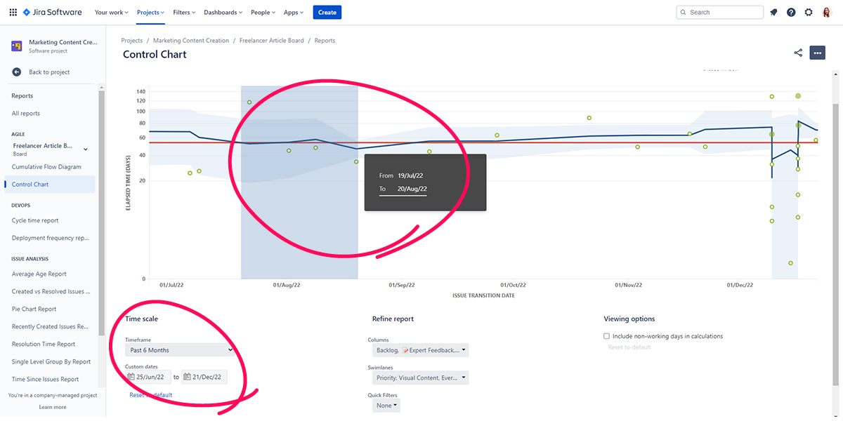
You can also filter the Control Chart to display at least one or more work item states with the States filter.
Individual chart items appear as dots. The horizontal position of each dot reflects the date you took off from the last state selected for display on the chart. The vertical placement provides information on the total number of days a work item spends in each state.
Pointing to a work item’s dot on the scatter plot shows details on work item state changes for the item. These details include:
- The total time spent in all of the user-selected states.
- The final day an item changed state, regardless of its state.
- Whether the item has already been accepted.
- The date the item was accepted.
- The time spent in each selected state.
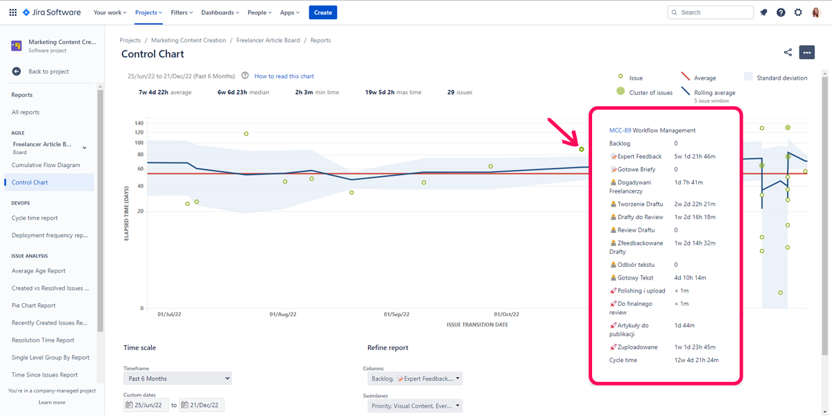
The Control Chart report also displays a line graph to reflect the rolling average. There’s also a flat line that gives the overall average of the data. An important shaded region on the display represents the standard deviation for the data. It’s an essential indicator of how outliers will impact overall performance. Outliers make data to imply what they don’t say, skewing the data in a non-meaningful way.
The fewer variations in average cycle time, the higher your confidence in using the median to give an idea of future performance.
What is the Cycle Time and Lead Time?
It’s important to clarify the distinction between Cycle Time and Lead Time.
Jira Cycle Time
Jira Cycle Time refers to the time necessary to complete an action from end to end. In this phase, you’ll label the issue as “In Progress.”
The Jira workflow you’re using determines the statuses used in calculating cycle time.
Jira Lead Time
Now, let’s talk about Jira Lead Time. It’s the time interval between receiving a request for an action and when that action is completely fulfilled. It’s important to note that when the request is received it isn’t the start of work. It also takes into account the time spent in the queue.
It’s usually preferable to illustrate these definitions’ using your favorite donut order. Consider a scenario where you make one. The steps the supplier takes to get the donut to you might be as follows:
- Prepare the dough.
- Blend in other appropriate ingredients into the dough.
- Put the dough into an oven and leave it to bake.
- Deliver the donuts to you.
There’s a time duration that it’ll take to wholly and correctly fulfill the steps to get your donuts to you. The cycle time, in this case, is the time it takes to prepare the dough, add in necessary ingredients, bake it, and have it delivered to you.
The lead time, on the other hand, is calculated from the point at which your order is received until the delivery man hands it to you wherever you are, or you’re ready to eat it.
The difference between cycle time and lead time is somewhat hazy, so it’s necessary to get it as clearly as possible.
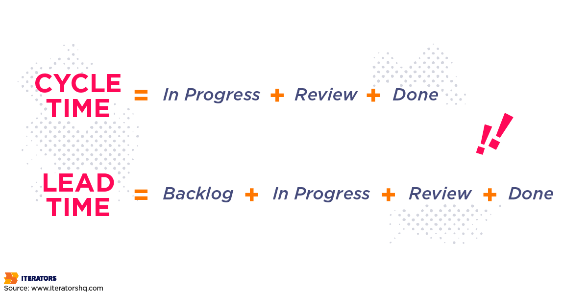
Cycle Time = In Progress + Review + Done
Lead Time = Backlog + In Progress + Review + Done
How to Use the Jira Control Chart?
Now, we’ll take a deep dive into Jira by beginning with the Control Chart. The first noticeable feature is that the Jira Control Chart sits conspicuously in the left Reports sidebar menu.
The red line of the Control Chart is a visual indication of the average time spent for your team to move an issue through selected statuses. Selecting multiple statuses aggregates the data. Conversely, the blue line represents the issue-based rolling average or the mean cycle time. Mixing these up is easy, so some explanation is in order.

The rolling average is computed as follows:
Average of cycle times of the issue
+ Average of cycle times of X issues before the current issue
+ Average of cycle times of X issues after the issue
The Jira Control Chart can help the user:
- Visualize the average data for one issue or a cluster of issues via dots on the chart.
- Choose a timeframe and analyze it for a specific project.
- Display tweaks and use column settings and instant filters to rapidly customize the report. For instance, you can remove non-working days.
In the event that your project differs slightly from the average lead cycle, you can still be confident that your project pipeline will continue to function seamlessly. However, strong spikes shooting well beyond the average on a Control Chart diagram suggest an issue with your team’s workflow. It may be due to delays, downtimes, pauses, and long waiting periods.
How to Navigate the Jira Control Chart
Here are the steps to navigate the Jira Control Chart:
- First, choose the Reports icon from the left navigation menu.
- Next, begin to type the report’s name in the Search box.
- Once you find the report you need, select it.
However, note that there are categories on the left that you can use to locate needed reports.
Prerequisites for Using the Jira Control Chart
In the spirit of good housekeeping, here are a few points to note before using the Jira Control Chart:
- In the Configuration bar, you begin by selecting a program (or a portfolio, or both).
- Then, you create features and assign them to a program.
- After that, you have to create and assign stories to a program.
- The features and stories must change in state since their initial creation.
What are the Different Charts in Jira?
There are various types of reports available within the Jira Control Chart. We’ll review some here.
Jira Cycle Time Report

The name of this chart type clearly suggests you can use this report alone to measure Jira cycle time.
The Jira Cycle Time report is made up of two graphs. The first of these visual elements is a weekly comparison that utilizes the number of issues during the 12-week period. The process of configuring this report involves choosing two things:
- The issue type.
- The issue epic.
The second visual component displays separate views of issues delivered each week. Pointing to the dot shows how much time it was at work.
Jira Cycle Time report and Control Chart are critical tools for measuring the overall situation of a project. Therefore, you can track cycle time and lead time data and run a graphical analysis on them.
Time in Status for Jira Cloud
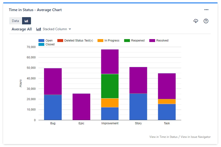
Atlassian offers an add-on on its marketplace for collecting cycle and lead times. This add-on is called Time in Status for Jira Cloud, and it enables you to keep tabs on cycle time and lead time by configuring Status Groups.
The drop-down list of statuses in the Column Manager allows you to set it from your account. Time is then summarized with respect to custom statuses in the status group column.
Let’s say your goal is to get Jira cycle time. Then, you must choose the statuses representing a time for different In Progress stages. For instance, using the Jira Software Development workflow, your team’s work on an issue only begins when it’s in the In Progress phase and ends once it’s moved from In Review to Done.
Time Between Statuses
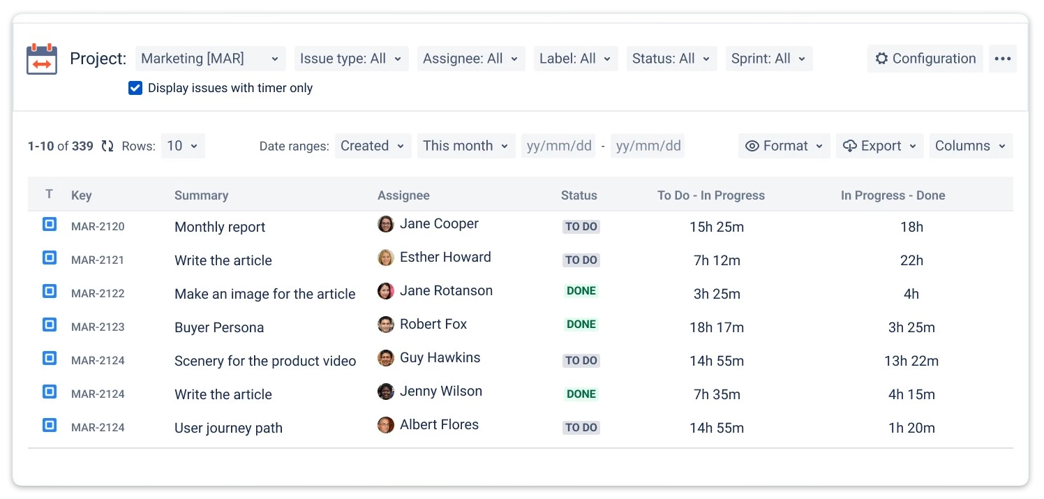
The cloud and server Time Between Statuses plugin from the Atlassian Marketplace is significantly different from others in several ways. First, it computes the number of connections in a workflow by evaluating the transition time that issues take.
The Time Between Statuses app helps in locating the problem area and notifying the user in time. As a result, you’ll be able to promptly fix it.
To measure cycle and lead time, set Start, Stop, and Pause statuses in the configuration manager. Then, you need to choose the First/Last transition to/from status to specify the computation conditions. It increases the flexibility of the timer.
The capacity to receive visual alerts is valuable in dealing with many processes. Therefore, you can define Warning time limits. For example, the system will send a notification via e-mail to the appropriate admin if an issue takes longer than anticipated. You can also establish Critical time limits.
It’s the final warning to alert the project manager about a significant workflow issue. Identifying a problem makes it easier to work toward a solution.
Other Reports
Besides the Jira Cycle Time Report and Time in Status Report for a cycle or lead time, you can also use the following Jira reports:
- Average Cycle or Lead Time, to help you generate the Average Time report.
- Cycle or Lead Time per Date, for selecting the Time in Status per Date report.
- Jira Cycle Time and Lead Time per assignee, generated from the Assignee Time Report.
Customizing Reports Using Cycle or Lead Time in Jira Control Charts
The Control Chart offers several customization options that give the user fine-grained control when displaying data.
In order to customize your reports using cycle or lead time, here are the steps to take:
- Select the necessary issue from the list of projects or sprints, and apply tagged flexible filters.
- Specify the data range and format for the data.
- Using a multi-calendar, remove non-working hours from the cycle or lead time calculation.
It’s also possible to add a custom report to the Jira dashboard using the Gadget tool.
Exporting data to Microsoft Excel, Google Sheets, or another suitable spreadsheet application (in XLSX or CSV formats) allows many users to explore these reports when needed.
The Control Chart features several customization options to enable you to filter the display data. The chart has five main sections, some sections, in turn, hosting various sub-options, including:
- Issue detail: Each green dot represents an individual issue. The dots are a scatter plot based on the completion date and time to complete, and darker green clusters mean multiple issues. You can click each green dot to reveal the data for the issue in question.
- Refine report: A nifty way to select quick filters, columns, and swimlanes.
- Quick Filters: Choose from a list of filters you’ve favorited (bookmarked) or the other available filters. The JQL (Jira Query Language) is handy for creating your own quick filters.
- Columns: Allows the user to filter data under categories such as “Starting,” “In Progress,” “Testing,” and more.
- Swimlanes: Allows you to choose from several categories, including Assignees, Queries, Stories, and so forth.
- Time scale: This feature helps you to configure the time period you prefer to view the data for. There are two options for time scale:
- Timeframe: Choose the desired time frame, such as the past week, past month, and all time.
- Custom date: This Time scale feature allows you to choose a custom date range.
- Viewing options: Allow you to remove non-working days from the control chart view.
- Zoom in: This helps highlight an area on the chart that has a better view of a specific period.
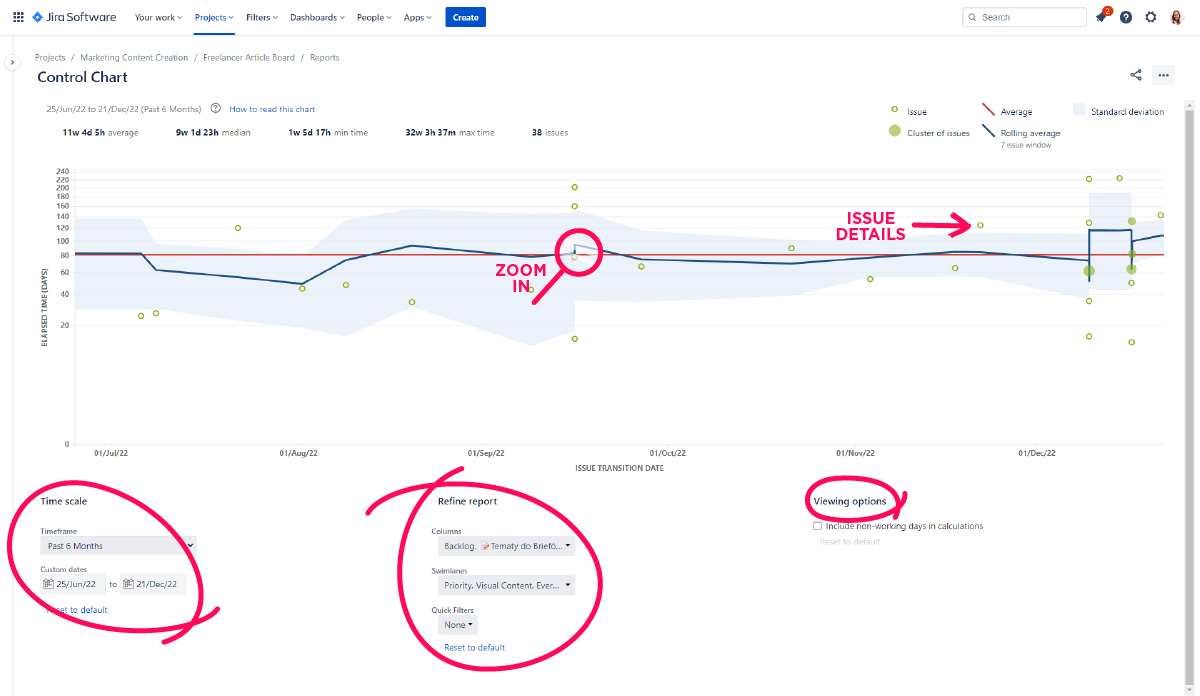
The Jira software’s Control Chart customization options are comprehensive in number and depth. These customizations are highly adaptable to your team’s needs and make it easier for external stakeholders to understand the Control Chart.
4 Tips to Customize Your Jira Control Chart with JQL

Here are four common ways to tweak your Jira Control Chart with JQL:
1. Remove unwanted outliers.
One of the key benefits of a Jira Control Chart is to identify outliers. But, of course, you may prefer that your chart shows them all. Removing unwanted outliers involves adding labels to each outlier issue and creating a quick filer for it using JQL: labels is EMPTY or labels not in (outlier).
2. Take out triage casualties.
The typical user tracks issues that have a “fixed” label. As a result, you may have triaged an issue or tracked it elsewhere, skewing the data in the process. To eliminate triage casualties, you can create a quick filter using JQL: resolution in (Fixed).
3. Subtract current work.
In its default mode, the Jira Control Chart includes all current issues in progress. However, if you want to view the data for completed work alone, the Quick filter JQL: status in (Resolved, Closed) is helpful.
4. Only show working days.
Each specific project determines whether or not you need to account for non-working days. Viewing Options at the bottom of the chart helps you to easily configure your Control Chart to calculate workdays alone or include total elapsed days.
With all these in mind, you can customize your Control Chart. It’s one of Jira’s most potent tools. For example, you can customize the process to show time spent on development, lead times, or Quality Assurance (QA). A Control Chart creates relationships between the time spent on issues to essential metrics such as the maximum and minimum time you’ve spent on historical objectives.
Control Chart customizations ensure that you and your team monitor for bottlenecks and identify gaps that enable you to predict future cycle times better.
Interpreting the Jira Control Chart Report
The Jira Control Chart report is especially beneficial for assessing performance. For example, suppose most of your work items spend a similar number of days in a work item state. In that case, the inference is that the team is relatively consistent. Similarly, a narrow standard deviation means that a team’s working pace is consistent.
Work items appearing well beyond the standard deviation may indicate that they were characterized by a large workload or needed special attention during the specified time frame.
The Control Chart is of great help in evaluating the effects that program-wide changes have on throughput. For example, a rolling average downward trend only means that work items are moving more quickly through states, suggesting a more effective change.
You can proceed to share the Chart Control report with external shareholders. All it takes is to select the triple line icon at the top right of the chart to print or export it in JPEG, PDF, PNG, or SVG file formats.
Ways to Optimize Development with a Control Chart
You can have custom cycle and lead time reports by modifying the available fields in the app interface. These include:
- Type of project.
- Date range.
- Time format.
- Multi Calendar, to set different calendars and non-working hours.
The transition time for a given issue can be seen via the Issue View Panel. This progress bar features three zones: red, green, and yellow bands. Time Between Statuses also enables the export of data you need to use tools that help you advance far into the cycle and lead time.
Now, here are a few recommended ways to optimize development using a control chart:
- First, probe your data to see the detail it holds.
- Note long-running issues.
- Improve your estimates.
- Exclude issues that lack a solution.
- Show only working days.
- Focus by status.
Tips and Examples
The following is a simple segment from a Jira Control chart:
TIS-67 Developer Toolbox does not display by default
In Progress 4d 12h 34m
Code Review 0
Cycle Time 4d 12h 34m
This pop-up reveals the amount of time the issue spent in the In Progress state. It’s clear to see where a slowdown occurs. Spending minimal time in each state helps teams minimize the amount of time in each state, so there’s a smooth delivery in the feature development pipeline.
If there’s something you want more understanding on, click on the relevant data in the Control Chart, and you’ll automatically zoom in for better detail.
Also, be aware that shorter cycle times help you to focus more consistently and deliver work more reliably. If a team takes 7 days to move an issue from In Progress to Resolved, this doesn’t suggest that it took 10 days of work to resolve the issue. If there are two issues in the In Progress state for 5 days, then both will have a 5-day cycle time on the chart no matter how much work you actually do.
Becoming more proficient helps your team to increasingly avoid outliers. Labels help tag such issues and create a quick filter to exclude them from the Control Chart.
Also, one of the best ways to improve team performance is to use story points to estimate issues in the backlog. Story points make for a flexible but simple methodology to compare the complexity of issues. Fibonacci numbers (1, 2, 3, 5, 8, 13, and so forth) are one common way to do story pointing. They offer easy distribution of complexity across the backlog.
But how exactly can your team improve estimates from previous iterations? That’s where a quick filter works best, allowing you to see all the issues with a story point value on the Control Chart.
Then, there are issues you can fix and those you don’t need a code change to fix. The latter are typically resolved faster. When you include such issues, it significantly lowers the moving average. The JQL resolved = “Fixed” is a neat way to fix this.
It’s recommended practice to review both data sets. It lets you see only issues that weren’t fixed and how those that aren’t quickly resolved are bogging the team down.
In terms of excluding non-working days, imagine that you have a distributed team. Suppose they’re working on the same backlog. In that case, it’s easy to disregard this feature because there’s someone paying attention to the issue queue. However, distributed teams typically have multiple devs working on the same issue. Therefore, your team must remove these days from the Control Chart if the assignee does not change over a regular time-off period (such as the holidays or the weekend).
The Control Chart can help with tracking time by status. It’s most effective for analyzing in-progress states where the team is actively working on an issue. For instance, including the to-do state containing all the issues in the backlog helps you to see whether the elapsed time per issue has far exceeded expectations.
It’s preferable to look at each In Progress status as an independent entity and an aggregate. Then, you can configure the Control Chart to show a single status or multiple statuses in the available options under the chart.
Where your team maintains separate code and quality review states, the Control Chart differentiates between the states to reveal issue hotspots. Understanding and taking care of these inefficiencies will make your team more productive and minimize the amount of work In Progress.
Conclusion
A Control Chart is an excellent tool that improves your team’s planning in the delivery pipeline. It’s a neat tool the Jira user can consult to track time spent on a product, version, or sprint to measure the current state to historical performance.
Using the Control Chart, you can improve your team’s project management by finding concrete answers to crucial questions such as:
- “Are we consistently delivering on time?”
- “What aspects of this project are slowing us down?”
- “Do we spend similar time dealing with all issues or sprints?”
A Control Chart helps you spot deviations quickly and improve planning for future timelines.
