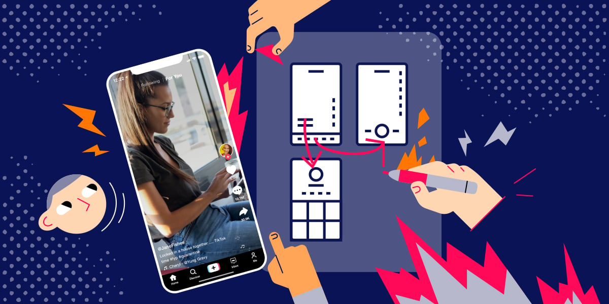
Since 2019 and through the peak of the pandemic, TikTok cemented its place as the new tech sensation. Besides hanging out on Zoom, you and your friends probably made content lemonade from the lemons of lockdowns and vaccine protocols on this shiny new mobile app. From the beginning, TikTok was primed for the top and there were no pretenses about it.
But, what made TikTok tick beyond the COVID clock? In this article, we’ll look at the main factors that made people like you choose TikTok over Instagram, Twitter and YouTube.
Could it be that the craving for something new and different in an attention-deficit world contributed to TikTok becoming so popular for everyone? The user interface or UI design of TikTok played a big role in helping the app become an overnight success. Sticking to that premise, we’ll now review 5 TikTok UI choices that made the app successful.
What is TikTok?
“TikTok’s feed is addictive by design, leveraging the psychology of random reinforcement. By removing the friction of deciding what to watch and delivering a endless stream of bite-sized videos, it hooks users with dopamine hits, much like gambling.”
Izabela Kurkiewicz
Let’s talk about what TikTok represents, in case you didn’t know. The name may sound familiar, but this article will give you a better understanding of what the app does and why it’s so popular with young and old people alike. So, what’s TikTok?
TikTok is a video-focused mobile application that enables users like you to make videos of up to 3 minutes in length, accompanied by music.
A TikTok video may feature a comedy performance, dance routine, emotional expression, script imitation, skill sharing session, life record, or other content form.
TikTok’s Success
Success is a relative term but is the holy grail of social media apps. Yet, by any standard at all, TikTok has earned and sustained success.
As a free-for-all video creation app, TikTok has won over a global army of enthusiastic content creators and content consumers. But, it has gone further to win over brands with a bent for traditional social media advertising.
Using artificial intelligence to drive precise user feeds means advertisers can trust TikTok to deliver the most bang for their buck than anywhere else.
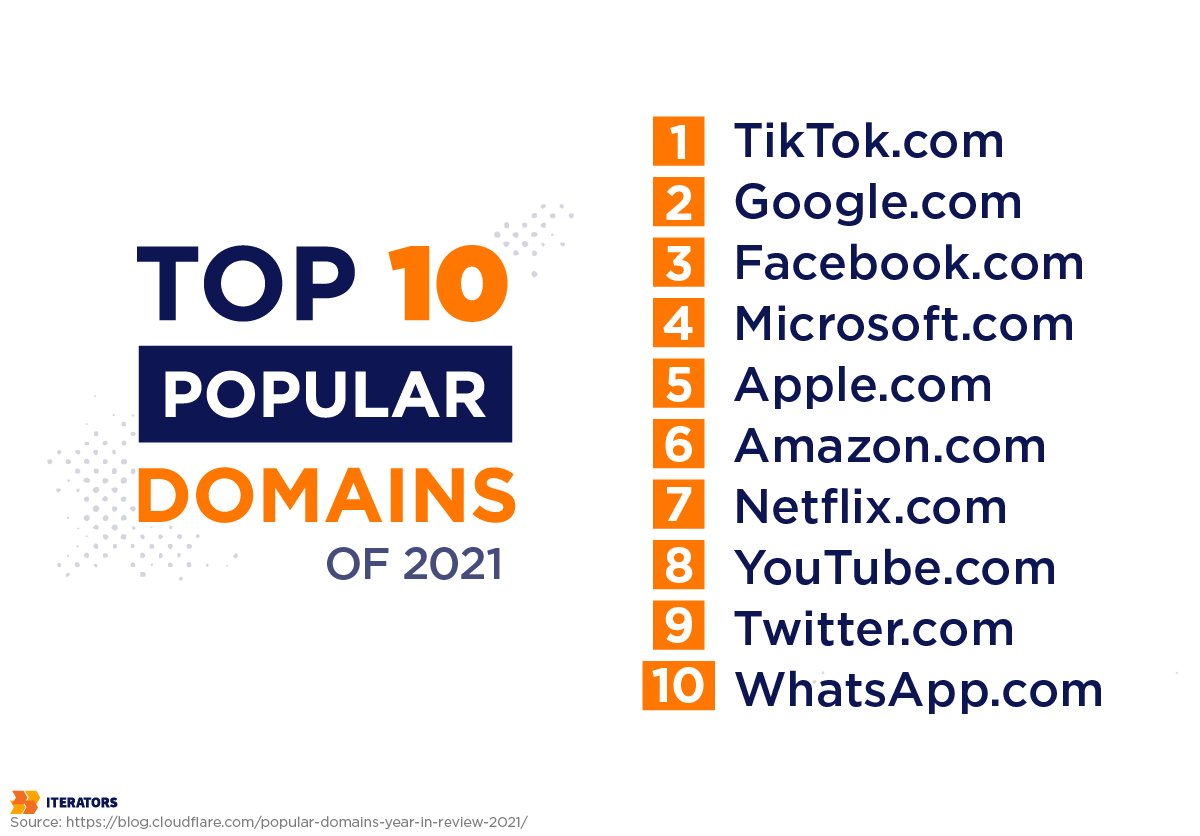
Just so you know, Cloudflare ranked TikTok as the most popular website of 2021, surpassing Google. That says a lot about the social impact of the app.
With expansion into more than 150 markets and 75 languages, no one can dispute the fact that everyone loves TikTok. But, we need to highlight the fact that TikTok is growing its footprint in the business world and among governments through strategic partnerships. These collaborations are with companies such as Oracle, Sony Music, and the United Arab Emirates.
It remains the first non-Facebook app to be downloaded 3 billion times.
TikTok UI Choices and Psychology Behind Them
TikTok is unique in many ways. Perhaps the first obvious thing to note is the app’s designers do everything they probably shouldn’t for an app. Like Snapchat, users experience a level of “weirdness” that’s exhilarating and not found elsewhere.
For instance, TikTok doesn’t have a playback or Start button. This is way different from other apps on the market. For TikTok, the video automatically starts playing when you open the app. This is less stressful, right?
You scroll through TikTok videos by swiping up and down, pretty much like Instagram.
When you follow a TikTok account, the app loads your feed with similar accounts. In a world filled with many moments of agitation and tension, TikTok deftly fills the gap with an unending stream of funny videos.
It’s fascinating to install the app and your first questions are, “How do I make it stop?,” “Where are the friends I follow?,” “Where is my profile?”
These questions are interesting. But, not if you’re coming from a Snapchat background where the camera is open by default and text overlay is illegible on an image if you’re facing the light.
Therefore, TikTok’s design philosophy is to break all design guidelines and best practices. Apple’s human interface guidelines contend that insufficient contrast in your app makes it harder for you to read content. Google specifies one full page of text colors that are best for different backgrounds.
It’s natural to judiciously follow such “expert” advice, but TikTok unapologetically but politely begs to differ.
1 – You No Longer Have the Power of Choice
While the democratization of content is the norm, TikTok and other new-wave apps choose to go in an obviously different route. We can compare their app launch and first screen to an app such as Instagram.
Instagram’s first post-install screen is the main feed. Here, you can decide whether you should click on the stories section and watch your friend’s stories, scroll down the feed (as most will naturally do), see a great or not-so-great first post, or head over to the Reels tab.
With TikTok, you have no choice over the content you experience on the app. TikTok just shows you the highly ranked content at first (because of the cold start problem), and personalizes it more the more videos you pay attention to.
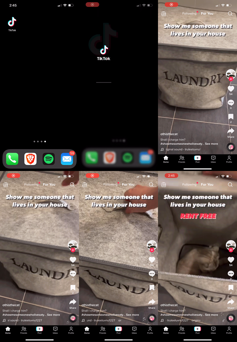
It’s obvious that TikTok’s designers are adherents to Hick’s law which specifies that presenting users with more choices makes it harder for them to make one.
They have opted for the Hook model approach, instantly rewarding the user after launch with a video they’re likely to love. However, the content is variable – typically a video of around 100,000 likes.
TikTok’s algorithm provides creators and users with a For You Page tailored to each one’s preferences. It continuously gleans insights on various user behaviors, such as watch time, sharing activity (hashtags, keywords, and sounds), generating custom data to deliver precisely relevant content onto your feed. Overall, this creates a specific and engaging user experience for every user.
Detailed personalization provides an equitable marketplace for artists, creators, and businesses of all sizes. With a continuously learning algorithm, creators and businesses will find it easier to access new audiences and customers who may enjoy and crave their content. Content types could be ads, live sessions, or video shorts.
TikTok has availed itself as yet another viable dimension for social media marketing, and businesses have wasted no time in wholeheartedly embracing it.
A More Efficient User Profile
TikTok’s approach to user profiles hasn’t exactly reinvented the wheel. It focuses on displaying pedigree information such as Profile Photo, Social Stats, Bio, and the 3-column Media Grid.
Of course, this is a social profile architecture that you’re familiar with. It mostly takes care of your general content consumption needs.
2 – The Content is Still King
“Speed scrolling” may have vocal proponents, but not being able to focus on one piece of content at a time means it’s easy to miss out on good relevant content. Now, imagine all the good stuff you have missed while skimming across content feeds. Not good, eh!
TikTok allows users to see and judge one video at a time, but then the app needs to understand what kind of content will thoroughly engage you. The algorithm ensures you don’t waste time scrolling between posts by serving you with useful posts.
Views, likes, comments, and shares will help you quickly tell if a video’s worth watching or not. The more of these metrics a video has, the more you’re likely to enjoy watching it. Now, you can see why content creators work hard to amass as many likes as they possibly can since you’ll be judging them by those numbers.
Simplicity is the soul of the TikTok app. Interacting with the app is as simple as swiping anyway you want it.
TikTok’s swipe interaction model makes navigation slick and easy. The content fills your screen – zero distractions – and in the thumb access zone, you’ll find the creator’s name, description, music, and reactions.
Some users view this one-post-at-a-time approach to be similar to playing a slot machine game. In this case, your input (swiping on a TikTok video) is like pulling a lever on the one-armed bandit. As you do so, you get more content on the screen.
The principle of variable rewards means you’ll keep scrolling in search of relevant content (which is often never far away).
You can swipe forever on TikTok because of something known as “infinite scrolling.” When you combine how simple the interaction is and the focus on content, it’s easy to see why you’re hooked to the app. TikTok ensures users have no way to stop the interaction.
TikTok takes interaction design to a whole other level by allowing you to use the bottom sheet to take action on content. This ensures you’ll stay in the video context and minimize your chances of navigating away from the Home screen.
The bottom sheet is easy to access in the thumb zone.
3 – Accessible and Localized Content that’s Inclusive and Relatable
In a bid to foster diversity on the platform, TikTok has poured ample resources into accessibility, targeting areas such as auto captions, and photosensitivity, and text-to-speech.
These features allow users with bodily impairments to enjoy far more content than they could on other apps. They also improve the experience of people without any physical disadvantage.
Auto captions
You’re probably wondering if the TikTok app would let you automatically generate subtitles for videos such that those with hearing issues can just read content. TikTok’s got you covered.
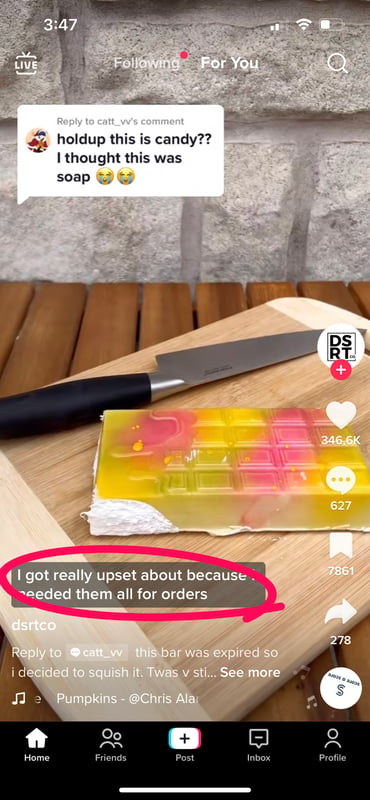
As a creator, you can enable and edit captions in your editor to display the automatically transcribed text on their videos.
The photosensitivity feature
When your feed loads, you can use the photosensitivity feature to skip photosensitive content. This is a neat feature for epilepsy sufferers. You can also choose to not see photosensitive content by toggling the Remove photosensitive videos option in your Content & Activity settings.
Text-to-speech feature
With text-to-speech, you easily convert text to voice, so visually impaired users can experience a more immersive viewing experience.
In the app editor, a creator can enable text-to-speech by tapping on the texts they’ve added to videos and choosing Text-to-speech.
Localization is a key component of accessibility, and TikTok is certainly not lagging on that front. TikTok was available in 75 languages and 154 countries by 2021.
TikTok localization doesn’t end with translation. The app intelligently maps tools, filters, and trends to local audiences.
Such innovative localization ensures that TikTok connects with large user demographics worldwide, and that’s hard to dispute.
4 – Make Videos Easy-Peasy and Baking Ads in With Content
TikTok is about videos and you don’t need a 4K camera to make a video the rest of us would love. Making a TikTok video is really easy; you make the video or upload it, add music, add effects or filters to your heart’s content, and push it to the world.
After uploading your video, TikTok allows you more creator goodness at the top of the screen by notifying you several ways to share your new video.
A maximum video length of 3 minutes exponentially inspires the creative juices of the user. The TikTok ethos is that there are no limits to creativity. User-generated content is what makes the app tick, and it’s arsenal of creative video tools and unique effects ensure the party never stops on TikTok.
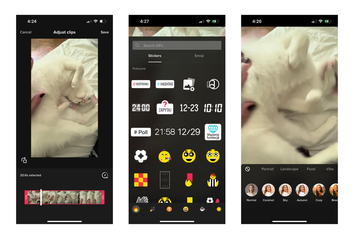
Creators are free to use the massive library of video editing tools, digital learning tools, and accessible creative effects to stimulate creative storytelling.
Anyone in any part of the world can use these tools, even on entry-level devices. They have access to use the available effects on their videos, regardless of the level of complexity.
In order to capture most mobile devices used worldwide today, TikTok strives to be compatible with dated Android OS (4.1+) and iOS (9.3+) versions.
When creators make videos these days, it’s common to immediately consider its long-term economic value. In the 2021 Kantar’s Media Reactions Report, TikTok polled 1st for ad equity.
According to the report, ads on TikTok ranked higher on ad receptivity than their competitors in the same study. So, what has ByteDance successfully taught the rest of us about the golden rule for ads? Where ad revenue is critical to your mobile strategy, you should at least optimize them to be unobtrusive.
Ads on TikTok blend in with feed content by matching format. This goes against the grain on other mainstream platforms.
Posts and ads use the same aspect ratio, positioning of major user interface elements, and interactive layout. The same design approach applies to how users close ads, swiping up like on regular posts.
This non-intrusive experience is beneficial to the advertiser and the user alike. Ads on TikTok are not as disruptive to the users activity. Also, advertisers have better opportunities to generate leads and engagement from their leads.
5 – Keep Videos Full Screen with Efficient Gesture Interaction
The field of interaction design covers the practice of designing interactive environments. The TikTok interface is what you see and operate, right? One of the key aspects of TikTok’s interaction design is that it chooses to display videos in Fullscreen mode.
Playing videos this way immediately draws your attention and reduces your cost in terms of learning to use the app. Janet Murray tells us there’s much better design value in a transparent design. The interface doesn’t seek attention but draws attention to the task or in TikTok’s case, the video content.
In other words, people automatically know how to use TikTok without thinking too much. The interface is neat and easy to understand. The main interface itself features only the most necessary icons, including post videos, thumb up, commenting, and sharing tools.
The comments feature of the TikTok user interface is another area where the app shines. When viewing and filling in comments, only one pop-up appears and the video continues to play.
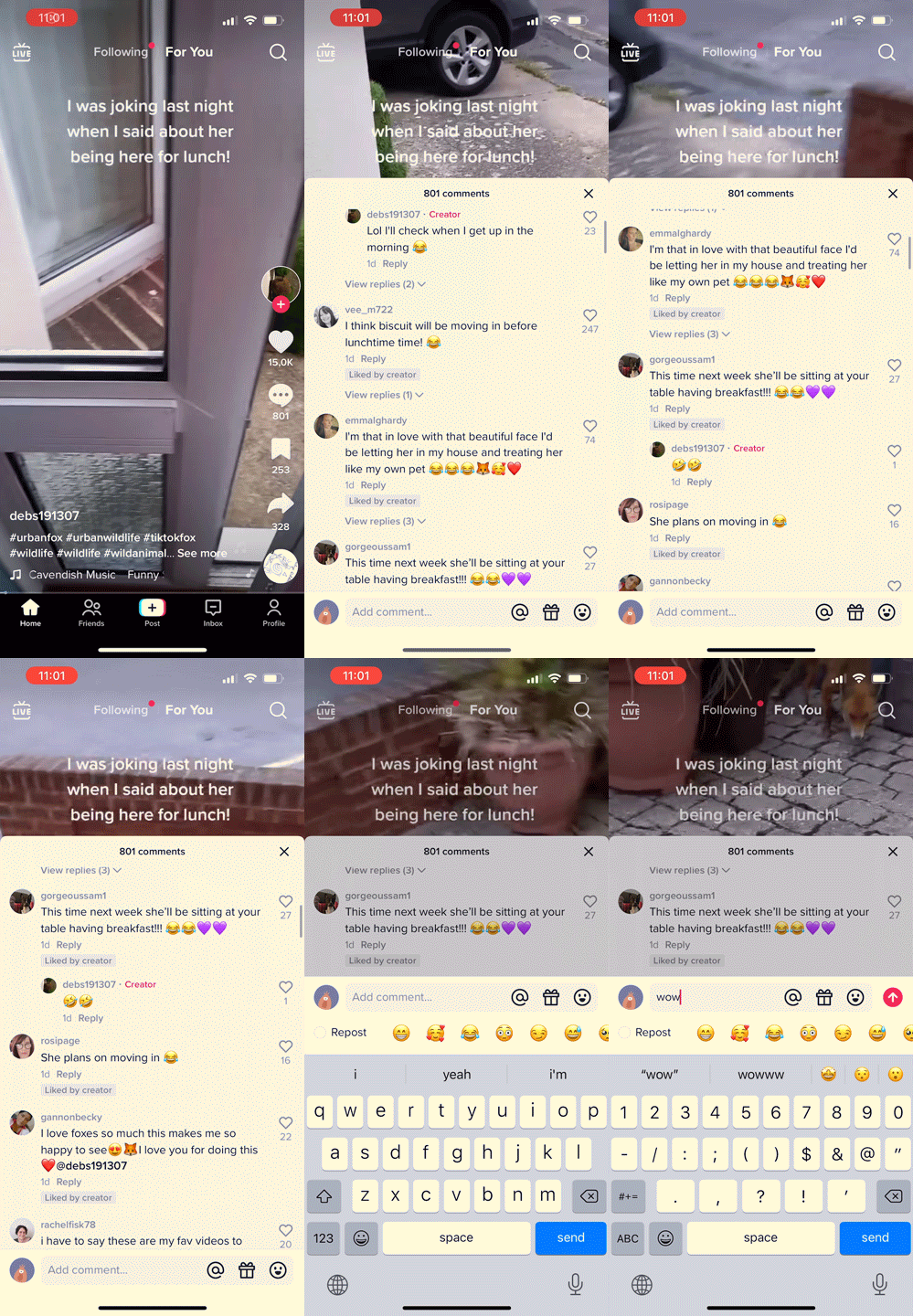
This pop-up design creates a continuous watching environment because even when you’re only seeing the video on half of your screen, the sound continues to play at high fidelity and volume.
Few apps deliver half the efficiency in gesture interaction that TikTok does. The reason this is important is that it provides proper conventions for users.
Having constraints in place ensure that the TikTok design is easy-to-approach and easy-to-use. Therefore, you have nothing to worry about in terms of making any mistakes when interacting with the app.
Phones make us scroll up and down to adjust the order of the page, and TikTok applies the same conventions. This means that a user can slide up and down to switch to different video content.
Making every swipe lead to new content makes for straightforward and efficient app navigation. If you want to learn more about the account you’re watching, you simply scroll left to see every video on the account. You can do most of this by swiping and clicking on a TikTok page.
TikTok UI and its Algorithm
ByteDance has heavily leveraged China’s desire to prioritize AI for global technological dominance. Forty-year-old founder, Zhang Yiming, initially set off to build a borderless enterprise after a stint as an engineer at Microsoft multiples shots at building companies in China.
Conni Chan, a venture partner at Andreessen Horowitz in San Francisco writes that TikTok and other AI-powered ByteDance products work in ways the rest of the world outside of China are familiar with.
In 2017, Zhang’s company paid $900 million for Musical.ly, a Shanghai-based social video app with 200 million users globally and a massive following in the US. This allowed them to combine TikTok’s AI-sourced streams and monetization with Musical.ly’s innovation and understanding of users’ needs and tastes elsewhere.
The outcome has been a TikTok with an easy-to-use interface combining click-bait news and entertainment to precisely match users. The intelligent algorithms decide which videos to show you, your entire feed, while learning your preferences the more you use it.
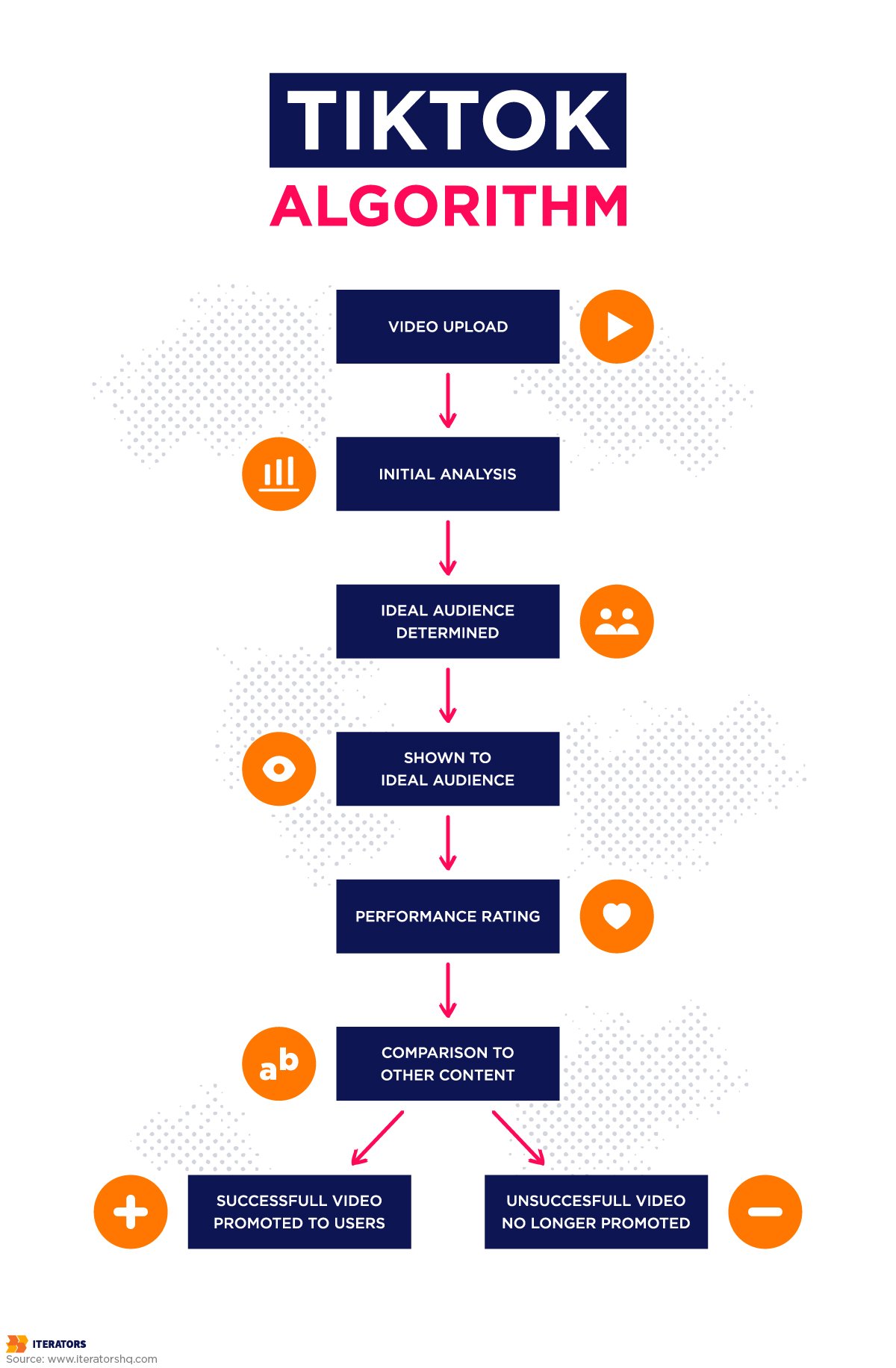
This approach is different from in other apps such as YouTube, Spotify, Netflix, and Facebook. Those apps depend on AI only to recommend posts and not to send feeds directly to users, according to Zhang.
How TikTok UI Influenced Other Apps
TikTok has fundamentally changed the rules of social media and the app’s global dominance continues to sweep across like a tsunami. By 2018, it had ranked fourth worldwide as the top non-game app downloaded, 663 million downloads behind Facebook (711 million) and some of its family of apps (WhatsApp and Messenger), according to SensorTower data.
In the first three months of the same year, it achieved 45.8 million downloads, outpacing Facebook, Instagram, and YouTube. By July 2020, it had become the most downloaded app online. After five short years, it’s safe to say that if you’re seeking the social network of choice, TikTok is the app to beat.
So, let’s see how the specific ways that TikTok has influenced major social networks.
Of the major social networks, TikTok seems to have stolen the most steam from Facebook. Zuckerberg’s army has responded by going to great lengths to create new features to tantalize younger generations, and reposition itself as a viral outlet for online users.
Live Streaming, video playlists, and series are some of these innovations. The social media company has also launched Lasso (a knock-off of TikTok) and Creator Studio (for managing Facebook Pages from one location).
Instagram also introduced new features such as Video, Stories, and Live as competing social media networks started to see the value of visual and dynamic content.

Reels was launched in 2020 and allows users to create and watch bite-sized fun videos. They can also comprise multiple 30-second clips.
The premier social network for professionals may have a different focus from others, but it’s also paying attention to the TikTok rumble. The platform now has a video cover option for users.
It doesn’t stop there, however. It’s now going for a more interactive and visual feed experience for users. This means that companies will now be able to post video ad campaigns and other relevant video content.
Twitter’s history with video is well documented. After Vine failed to take off as expected, TikTok seems to be forcing renewed investment in that direction as the live feeds trend has resurfaced and is spreading rather quickly.
YouTube
YouTube is still the standard platform for video content delivery. However, the company has now launched the YouTube Shorts platform to compete with TikTok. YouTube Shorts offers bite-sized videos to users. You can scroll and watch short videos directly from the YouTube app.
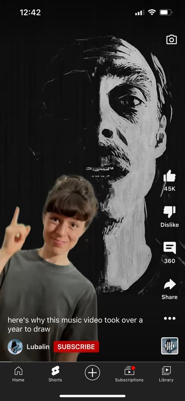
Shorts are special in that they let you discover other clips in which songs or sounds from the one you’re watching are used. Nifty, right?
Conclusion
There’s probably no better app example for how tasty visual design and behavioral psychology principles can be combined to keep users hooked and enhance engagement. TikTok employs a simple UX design that deftly juggles a good layout, positioning, and design interaction, while letting go of the repertoire of tools and features that hamper the user experience on many apps.
BJ Fogg’s behavioral theory highlights three elements that make a person do anything – motivation, ability, and trigger. Lowering the barrier to doing something makes it possible to use a smaller trigger and less motivation to elicit a specific behavior. This is something the TikTok design team has got down to a science.
Doing most of the heavy lifting for users from registration to video creation, while offering slick and easy navigation where infinite scrolling and simple swipe movements define everything is smarter than you’ll probably expect.
TikTok may be complex under the hood, but it reinforces that old message: Keep it simple, stupid.
